About the project
This was a redesign project where the brief was to address user feedback and improve the Via Eurasia app for the Culture Routes Society. Via Eurasia is a long-distance hiking trail connecting regions across Europe and Asia, designed to guide travellers through historic routes and scenic landscapes. The redesign aimed to streamline navigation, reduce screen count, and refresh the app’s visual identity to create a more accessible and welcoming experience for users.
The brief
The existing branding felt outdated, unsophisticated, and did not comply with accessibility guidelines
There were more screens than necessary, making the app feel cluttered
The typeface, Inter, should be retained but adjusted in size and weight to improve readability and hierarchy
The "Home" page is uninviting, resembling a legal document
Overall accessibility improvements were necessary across all pages, even those with minimal layout changes, to enhance user experience
Replace the "Check Before You Go" page with a simplified menu containing key topics (Route Updates, Weather, Guide Book)
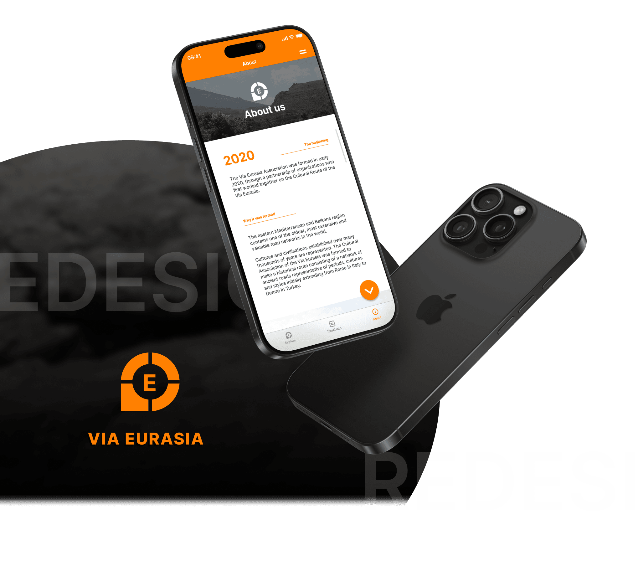
After removing legal text and logos, the "Home" page should become a welcoming landing page with an impactful new logo
Sponsor logos and information could be moved to the "About" page to improve visual appeal
My role & approach
My role was to redesign the Via Eurasia app, focusing on both UX and UI improvements to create a more intuitive, visually engaging, and accessible experience.
I began by analysing the app to map out essential changes and after implementing these, I conducted a second analysis to identify additional opportunities for accessibility and visual enhancements. For inspiration, I explored similar apps on Mobbin, Behance, and Dribbble.
Branding
“The branding and colour feel dated and unsophisticated, and they don’t follow accessibility guidelines”
I simplified the colour scheme to reduce the visual confusion and chose orange as the core colour to better represent the app’s purpose, conveying an ‘earthy’ yet modern feel.
I changed the logo to a location pin/compass to symbolise the journey and chose a block colour and simple design to create a more modern feel.
Original colours

Updated colours

Original logo

Updated logo

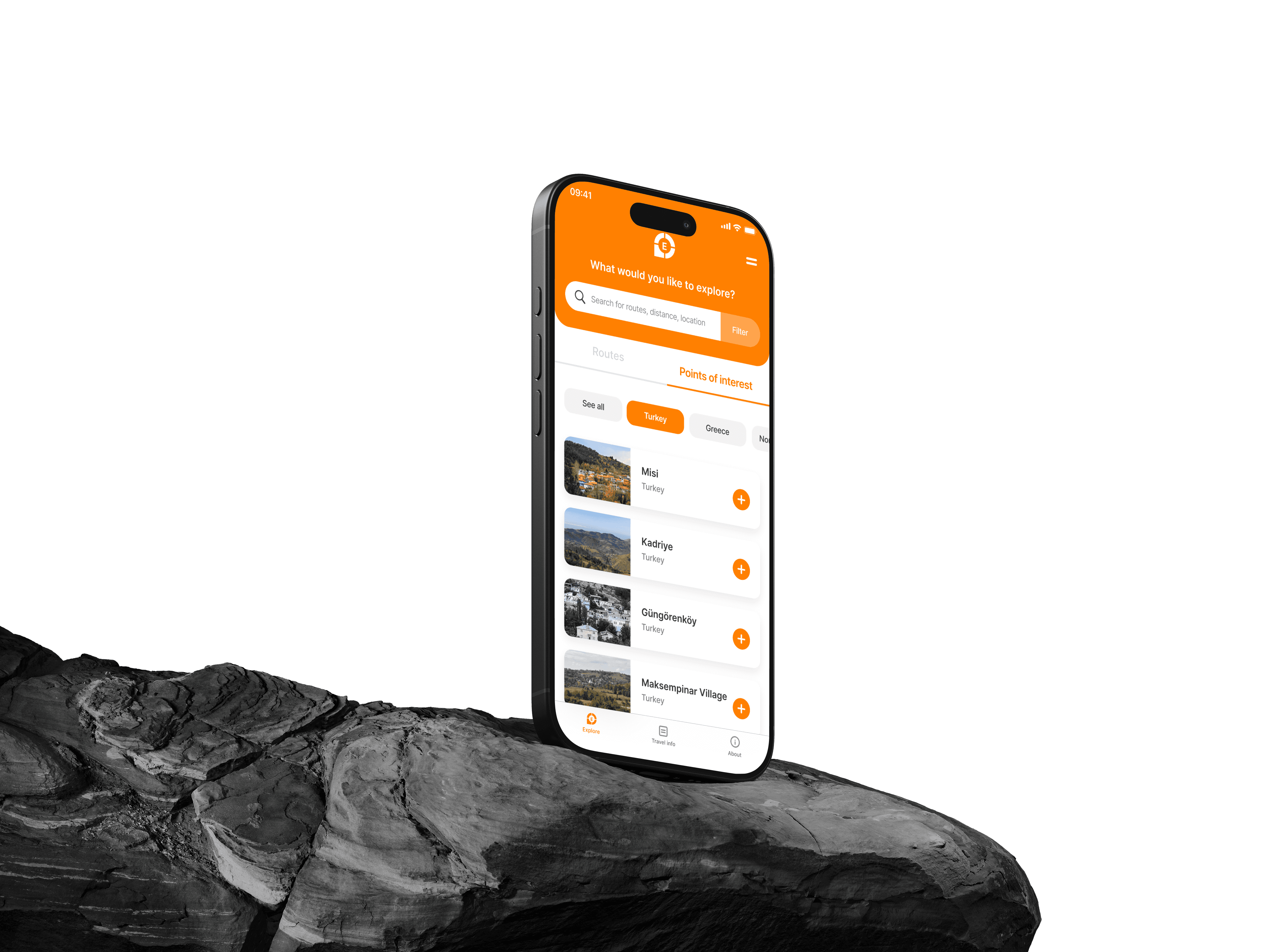
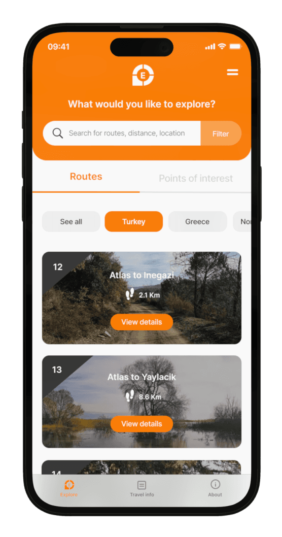
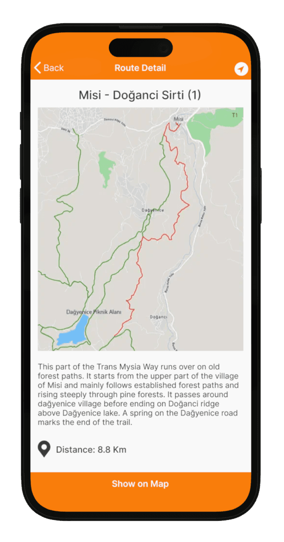
Redesigned screens
By incorporating insights from user feedback and analysing the app for further improvements, I redesigned each screen to enhance usability and engagement. Below are the updated screens, reflecting a refined layout, improved navigation, and enhanced accessibility.
UPDATES IMPLEMENTED
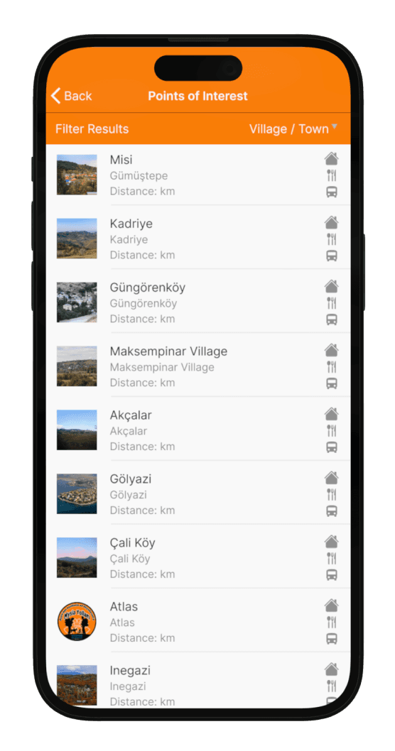
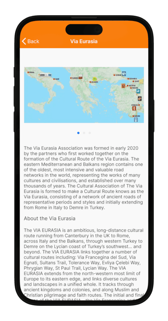
Original screen


Updated screen

UPDATES IMPLEMENTED
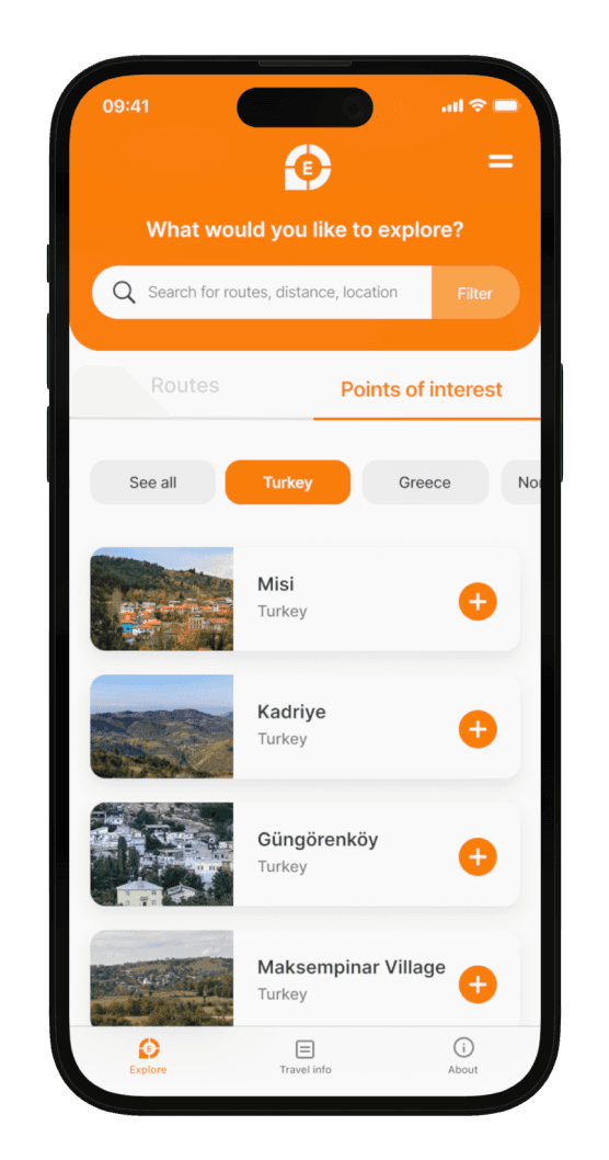
Original screen

Updated screen
USER FEEDBACK ADDRESSED
UPDATES IMPLEMENTED
Original screen
Updated screen

UPDATES IMPLEMENTED
Original screen
Updated screen
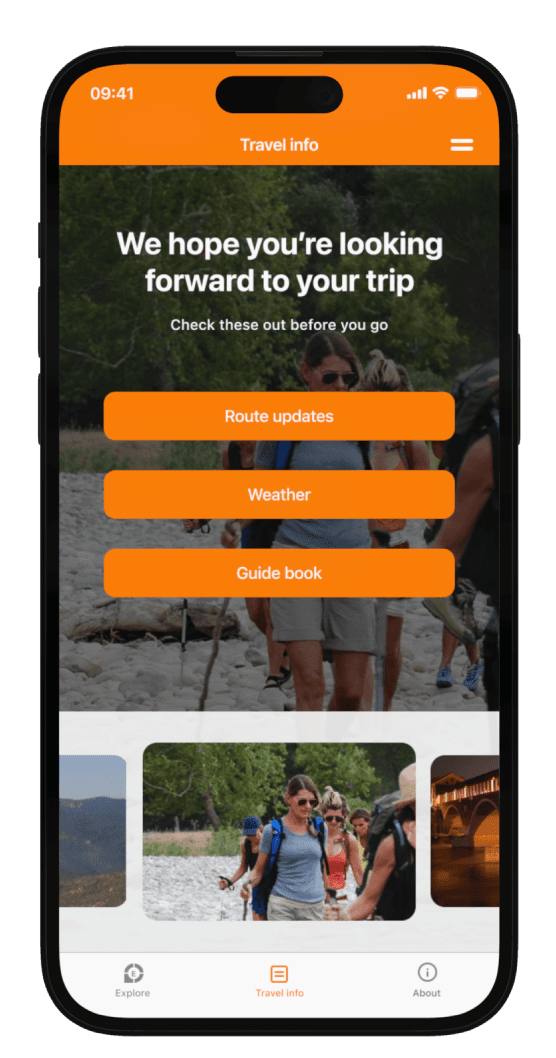
‘Remove the “Check Before You Go” page and replace it with a new menu that includes the same 3 button topics (Route Updates, Weather, Guide Book)”
UPDATES IMPLEMENTED
Original screen
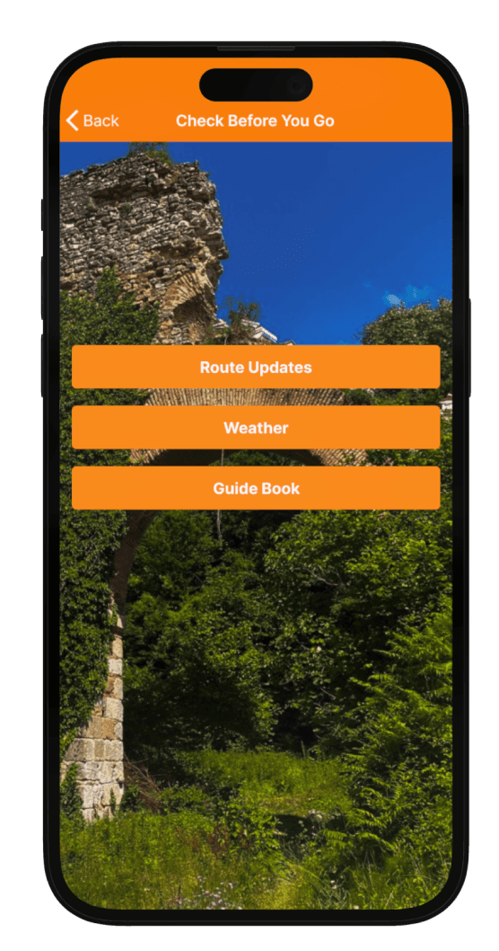
Updated screen
“The app’s “Home” page looks like a legal document and is uninviting. Experiment by moving the sponsor logos and information to the “About” page. The layout of the “About” page should then be reorganised to make it more visually appealing”
UPDATES IMPLEMENTED
Original screen
Updated screen

Takeaways
This redesign reinforced the importance of a user-centred approach in creating accessible and engaging experiences. I gained valuable insights on how small design choices impact usability, and I strengthened my skills in adapting designs based on user feedback and accessibility needs.