About
Planet is a responsive web app offering sustainable recipes. It hosts a diverse range of options to cater for various food preferences, making eco-friendly eating easy and accessible.
Industry
Food and sustainability
Problem
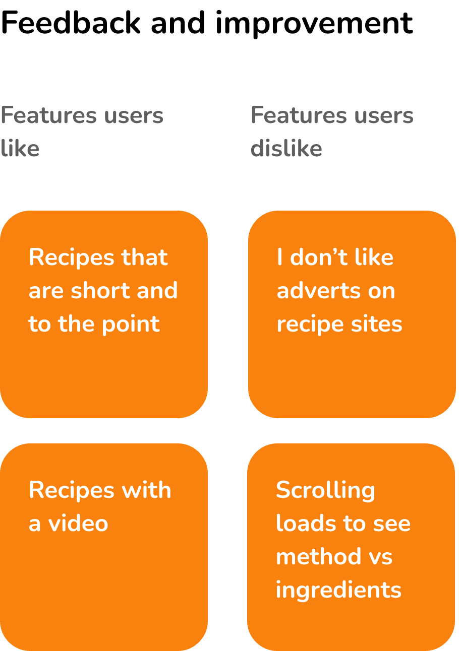
The recipe app market is highly saturated, leaving users uncertain about which recipes to choose. Many are not user-friendly, requiring excessive scrolling to view ingredients and instructions. Additionally, there is no one specific app focused on sustainable recipes that currently dominates the market.
Solution
To make sustainable eating accessible to everyone by creating a user-friendly app featuring a wide variety of recipes that cater for different food preferences and intolerances. From selecting meals to planning and buying ingredients, the app will guide and support users on their sustainable journey.
Approach
Combining a user entered design thinking approach with Lean UX creates a development process that is both user-focused and efficient, allowing for rapid iteration and continuous feedback.

Competitor analysis
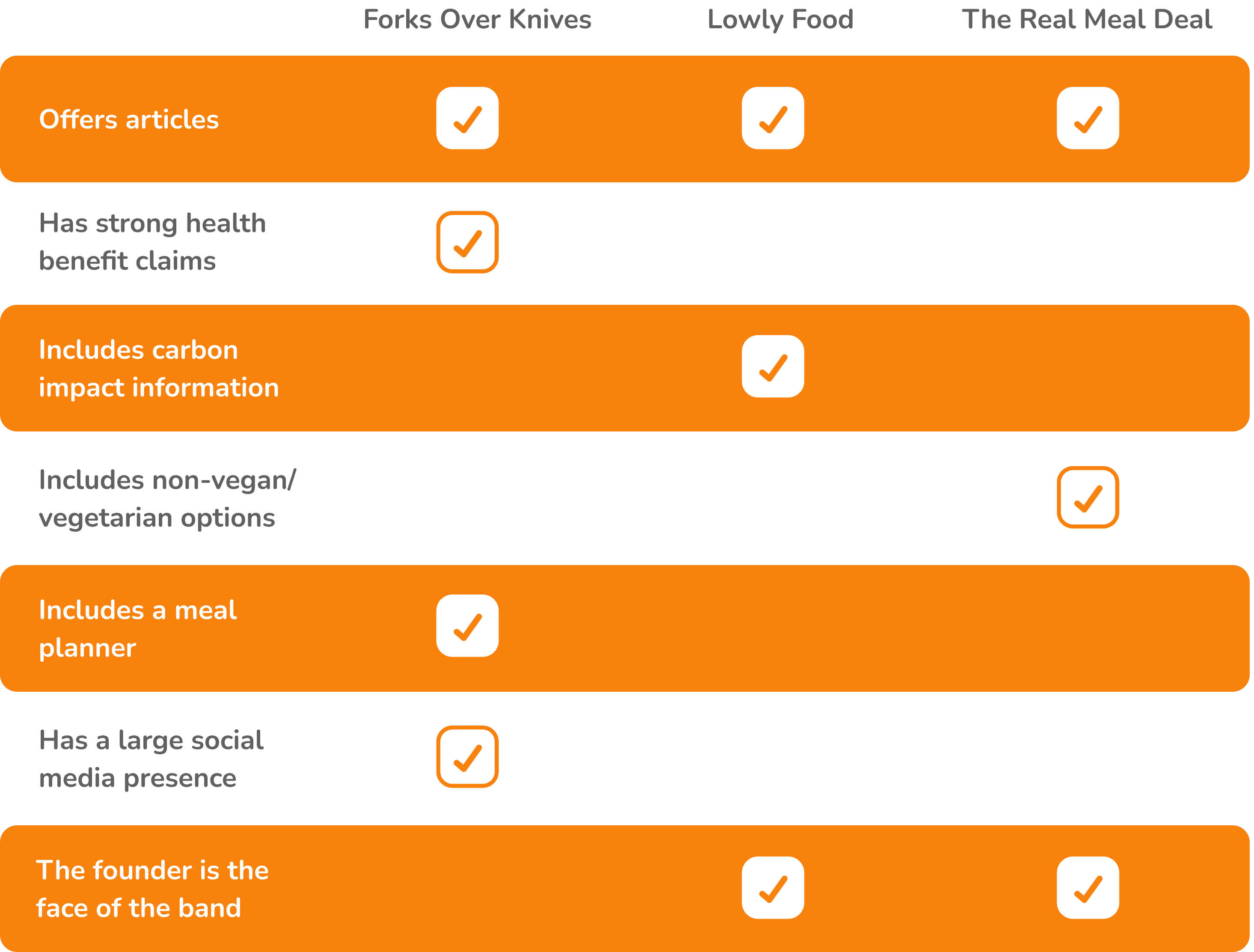
To understand the market, identify issues with existing web apps, and uncover opportunities for differentiation, I began with a comprehensive competitor analysis. This laid the foundation for my web app development, and helped guide the formulation of key questions for the next stage.
Process

User interviews
I next conducted user research to understand common behaviours, needs and frustrations. I did this through the research learning spiral, which consisted of developing my hypotheses, key questions, conducting 5x interviews with potential users, and synthesising results. This provided valuable insights that helped inform my decision making.
Participant | 2 & 3
Participant | 5
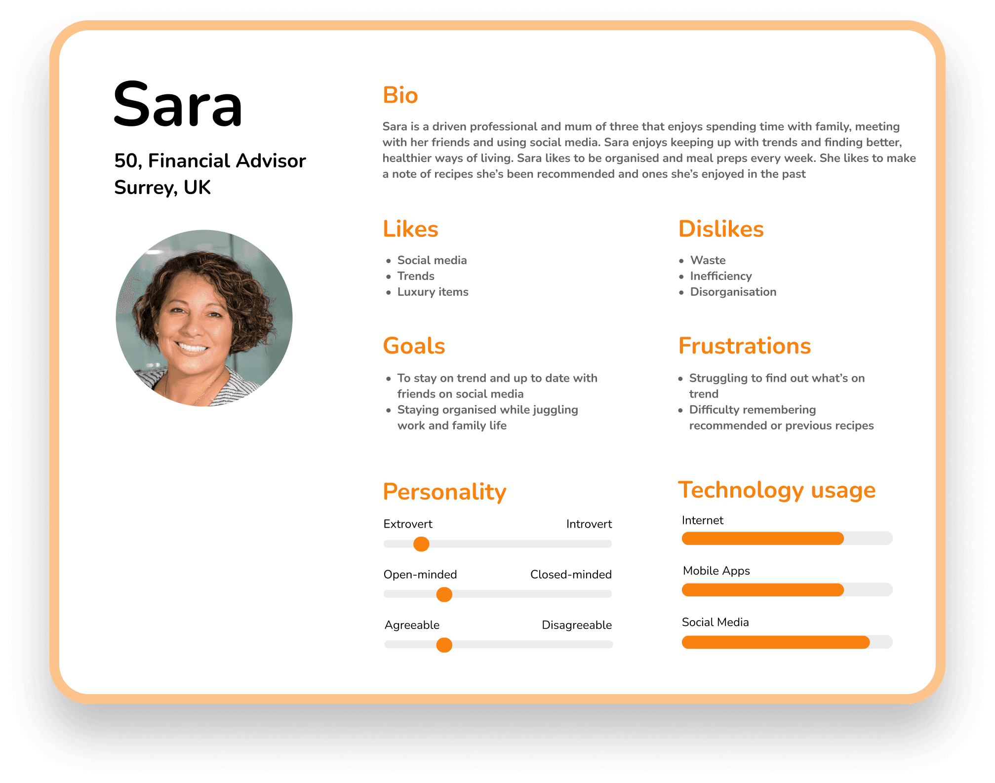
Participant | 1
Affinity mapping
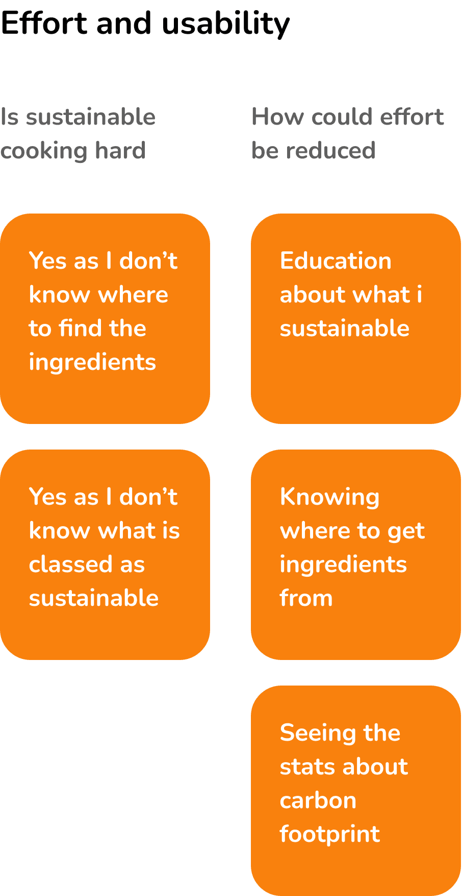
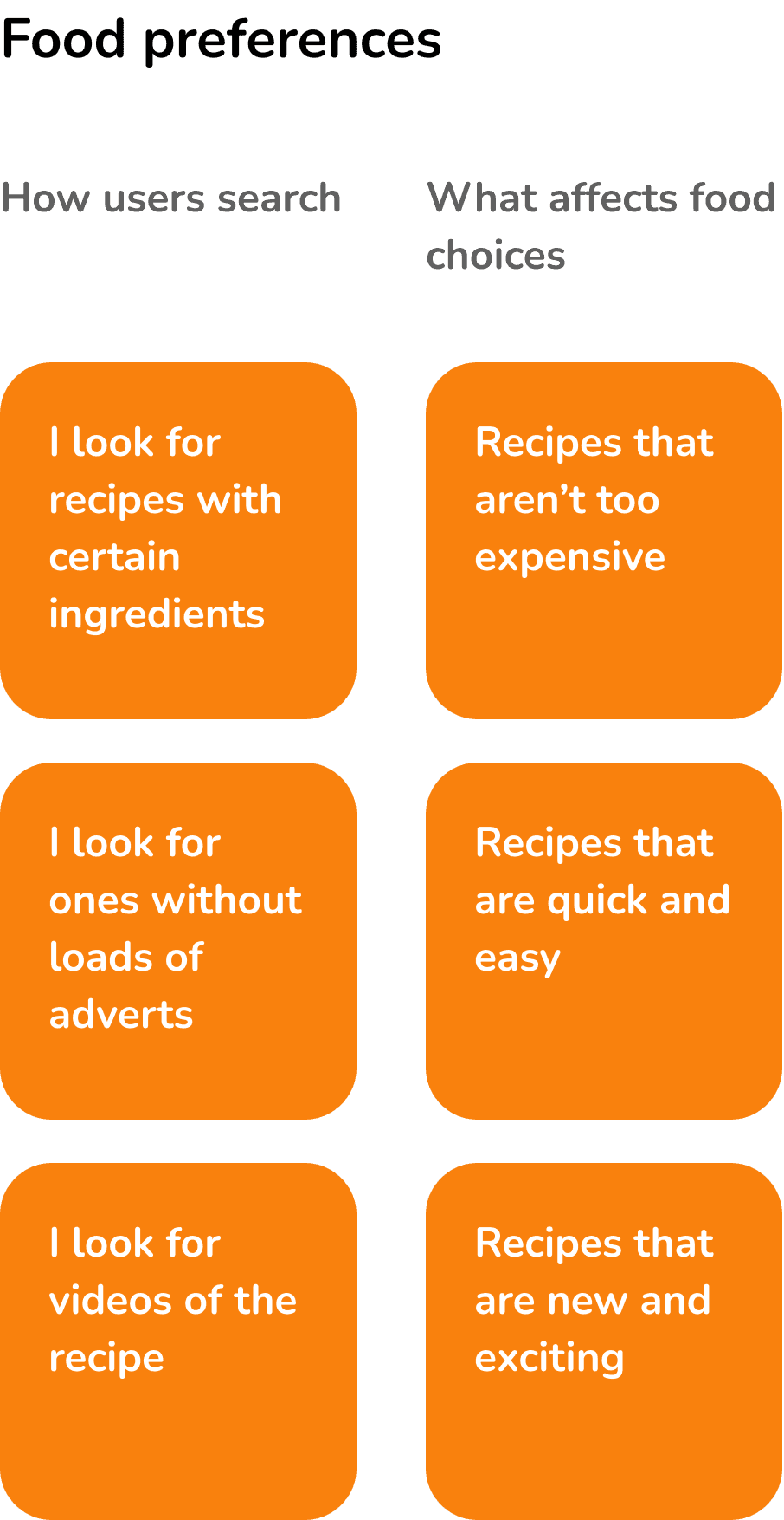
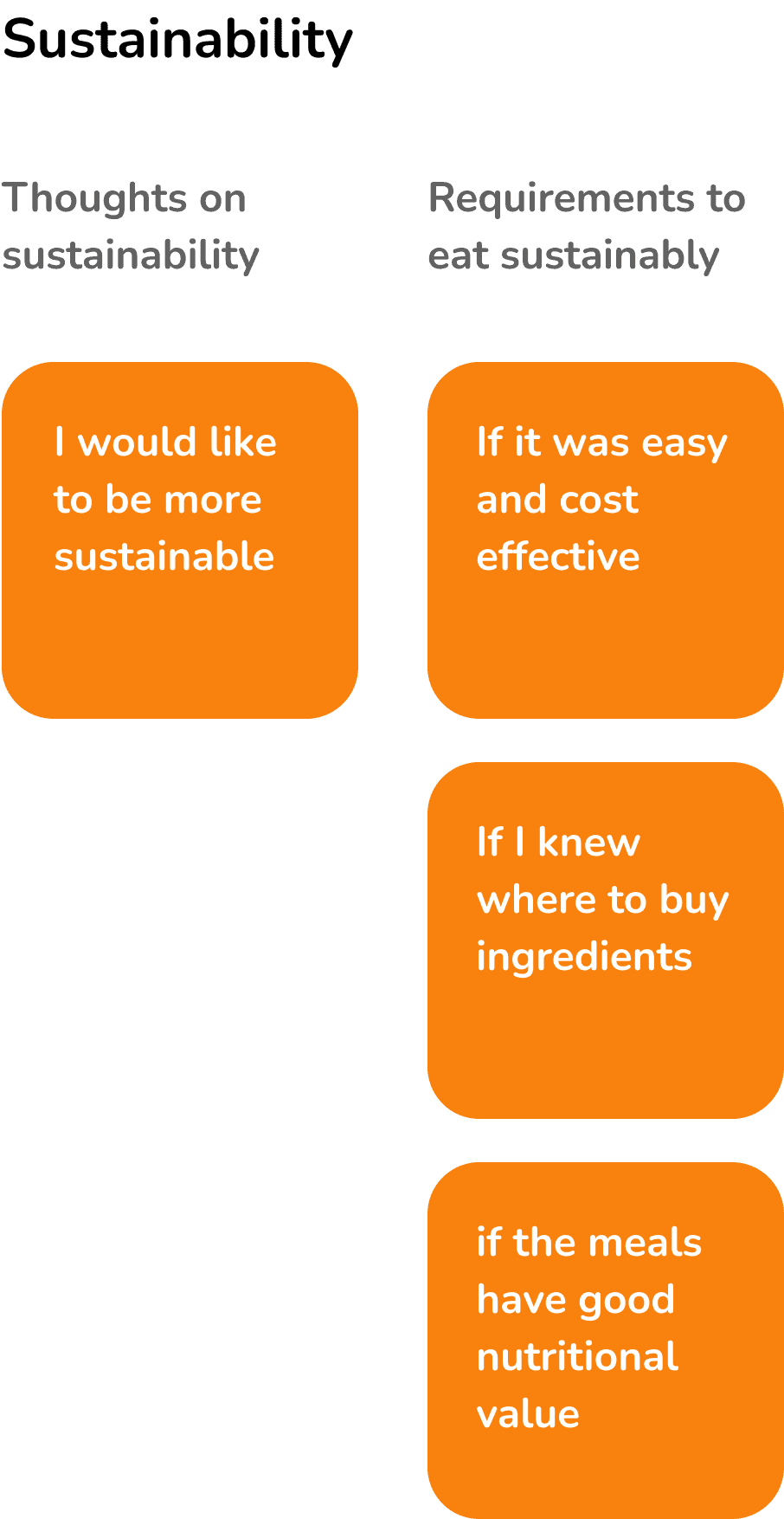
I used affinity mapping to synthesise feedback from the user interviews. This helped me to organise the information and identify patterns.

User personas
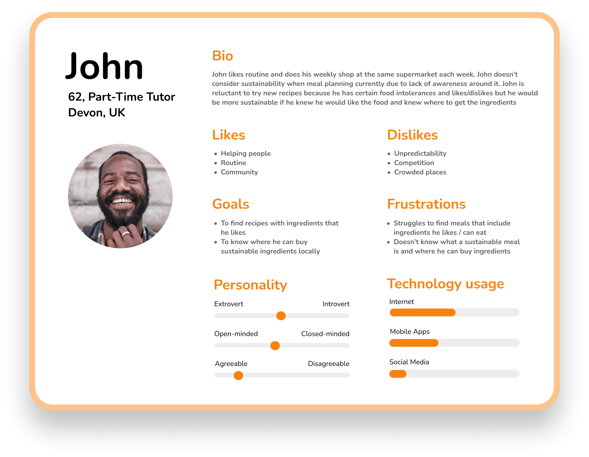
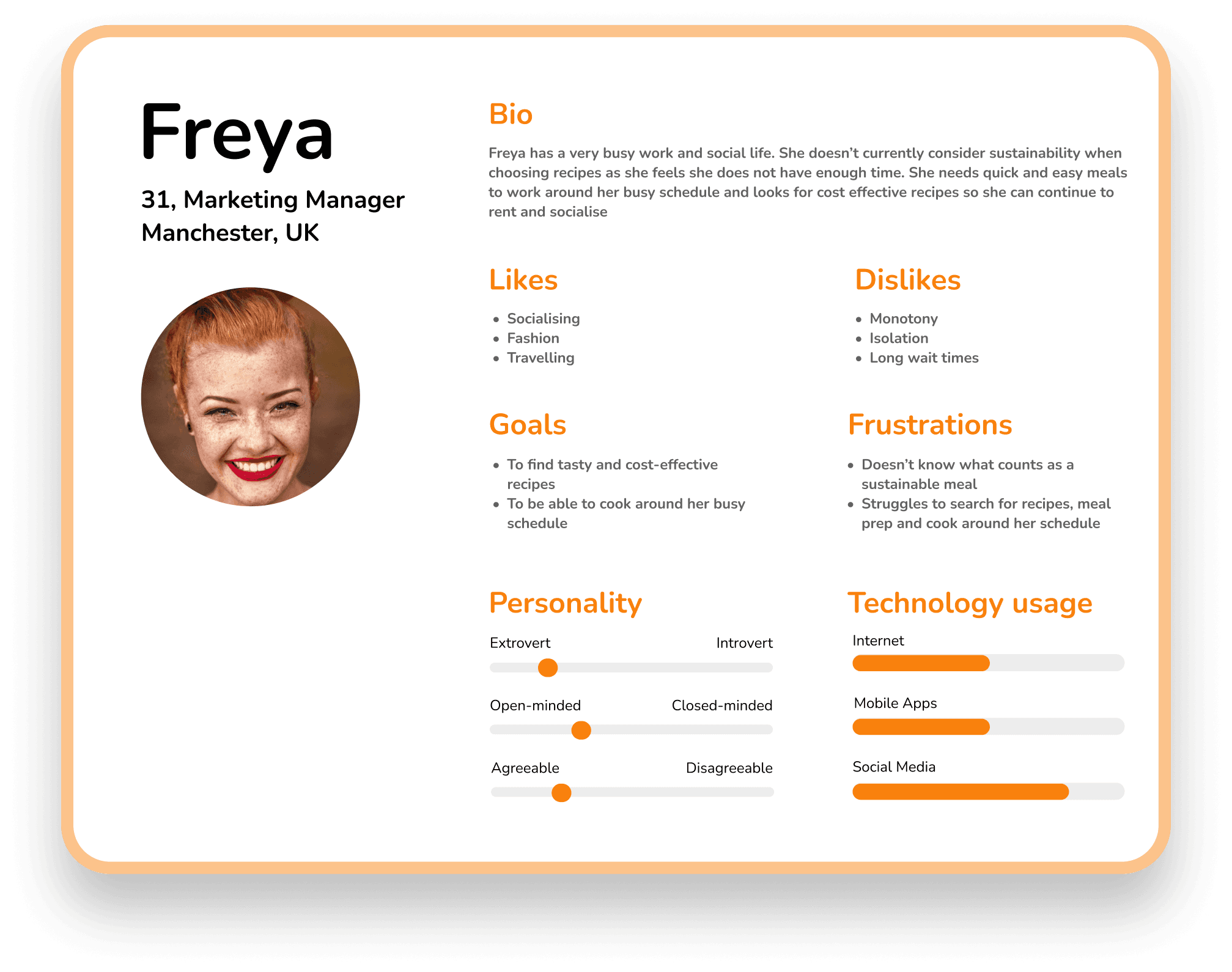
After synthesising the user feedback gathered from the interviews, I created user personas. Personas helped to ensure a user-centric approach by creating a visual and accessible reference point.

Minimum viable product
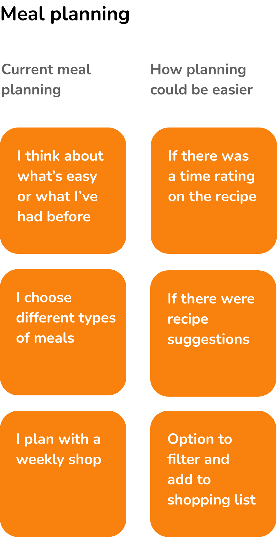
User research enabled me to identify which tasks and features were most valuable to users. The interviews revealed that users want to understand what makes certain foods sustainable, where to buy these ingredients, and how to reduce perceived effort. I therefore shaped my objectives around these insights.

To provide a variety of sustainable recipe options that suit different food preferences or intolerances
To make sustainable eating feel quick and easy with meal suggestions and ability to save and share recipes

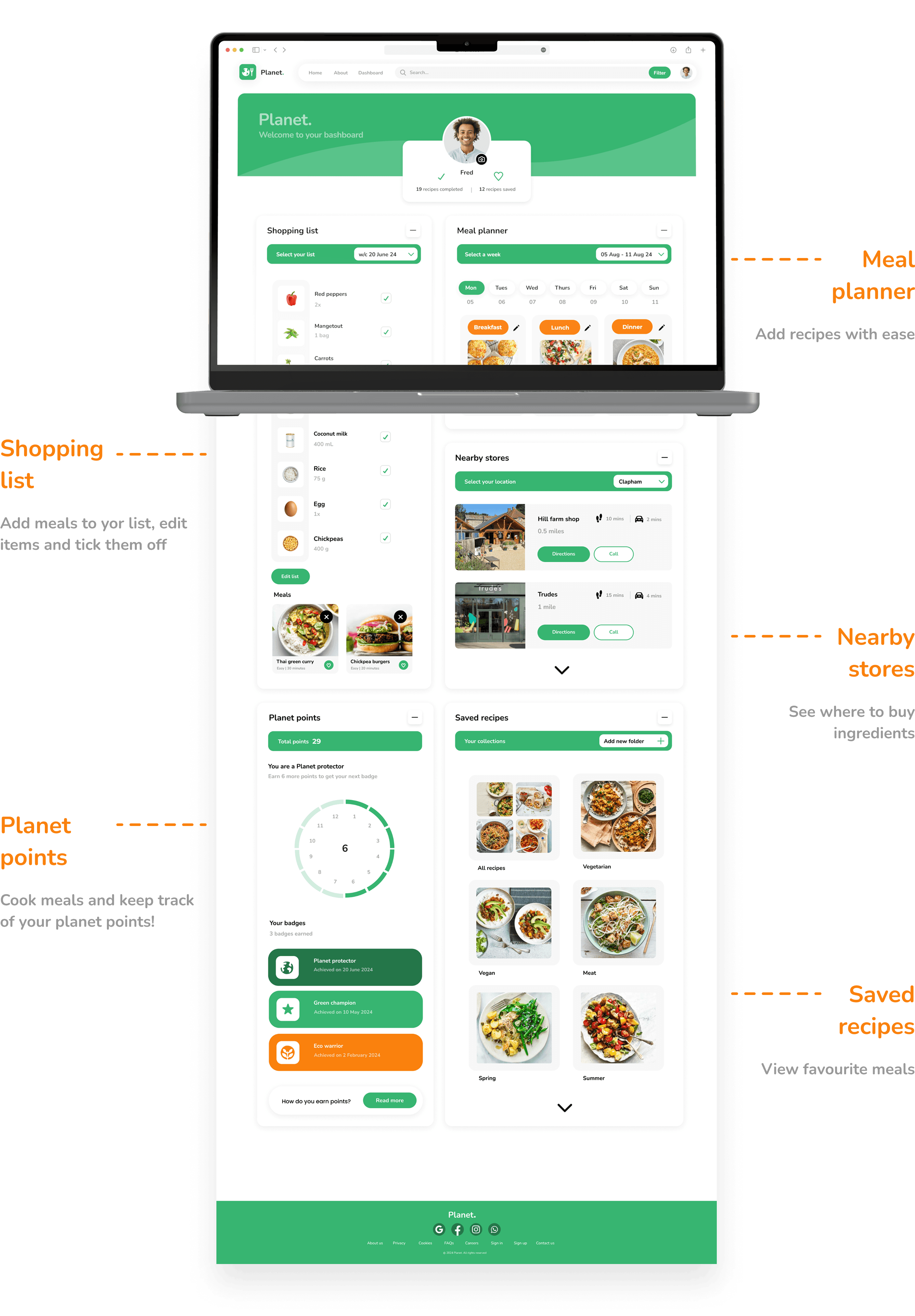
Allow users to add ingredients to their shopping list and tell them where they can buy ingredients locally
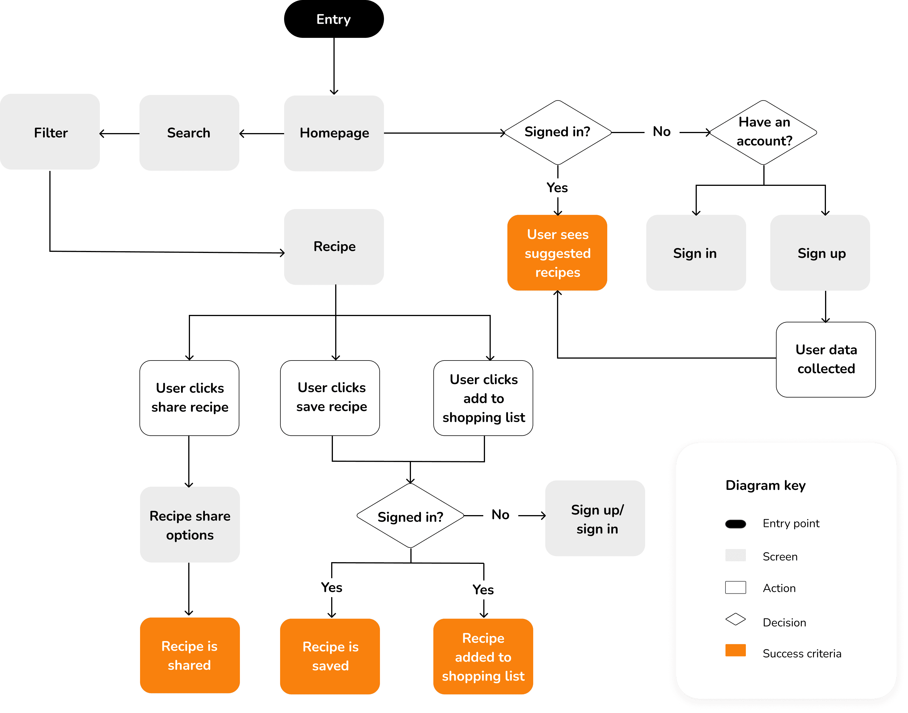
User flow diagram
After identifying the essential jobs to be done, I created a user flow diagram. This helped me to create a good user experience by highlighting and eliminating any unnecessary steps, and identifying any issues in the user journey.
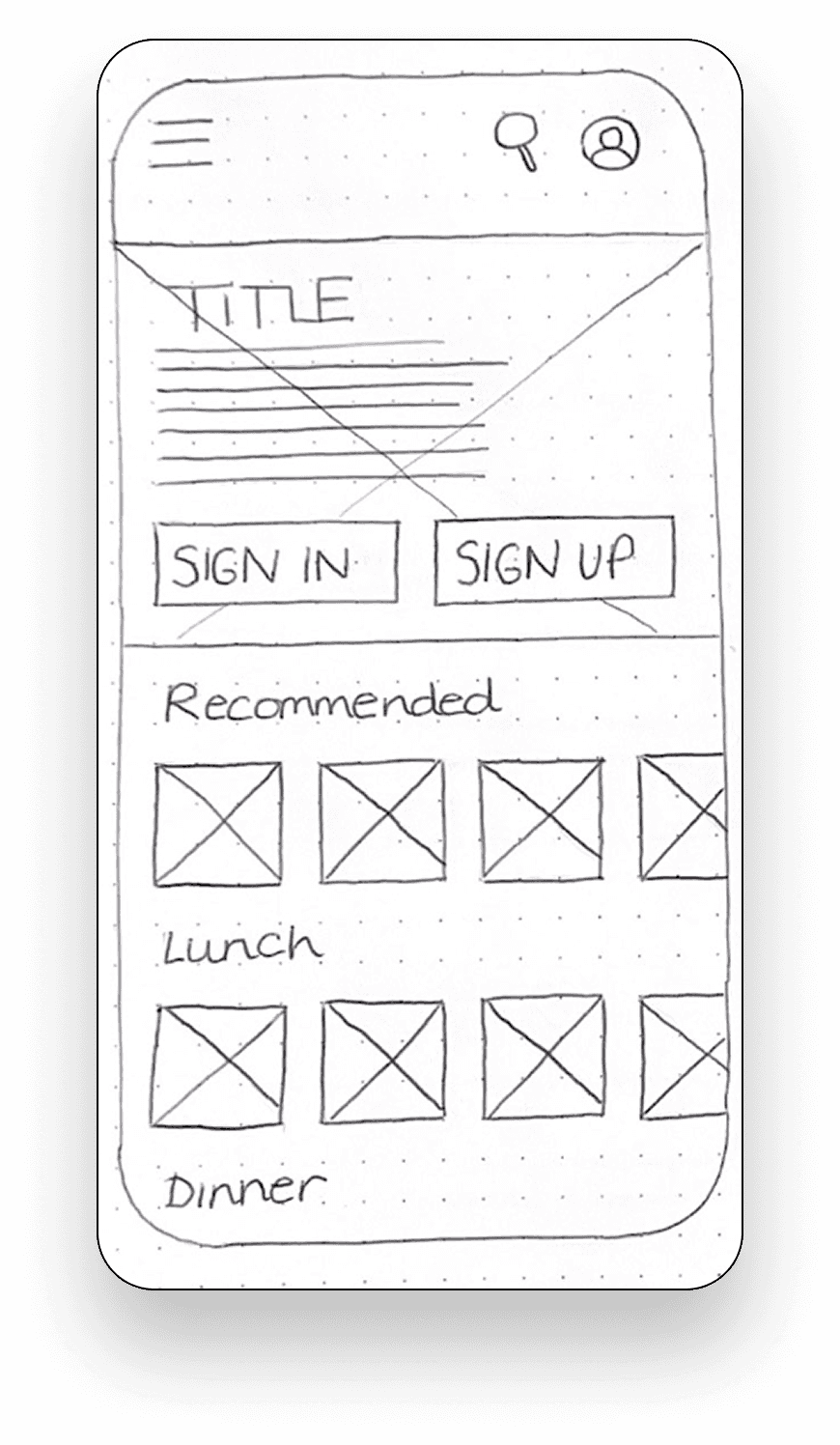
Sketching and prototyping
I initially explored various screen layouts for my app through using the crazy 8s sketching method. This allowed me to test multiple concepts quickly before committing to one idea. Following this, I refined my sketches into digital prototypes for usability testing.

Sketches for prototyping


Usability testing
Evaluate the ease and speed at which participants can save/share recipes
Determine if participants can intuitively add items to their shopping list / find stores
Examine how easily participants can filter search results
Using my low-fidelity prototypes, I conducted usability tests to gather quick and early feedback. This helped identify user issues and preferences before investing in the high-fidelity wireframes. This was also useful in validating assumptions to ensure the designs align with the user needs.
Result synthesis
The following usability issues were identified during the testing process.


Iteration and refinement
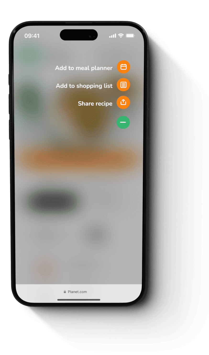
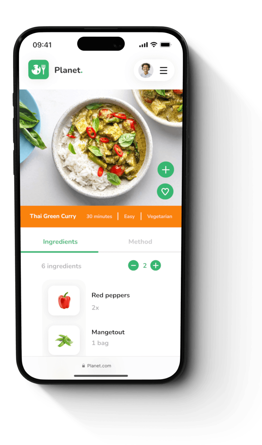
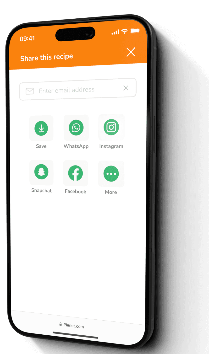
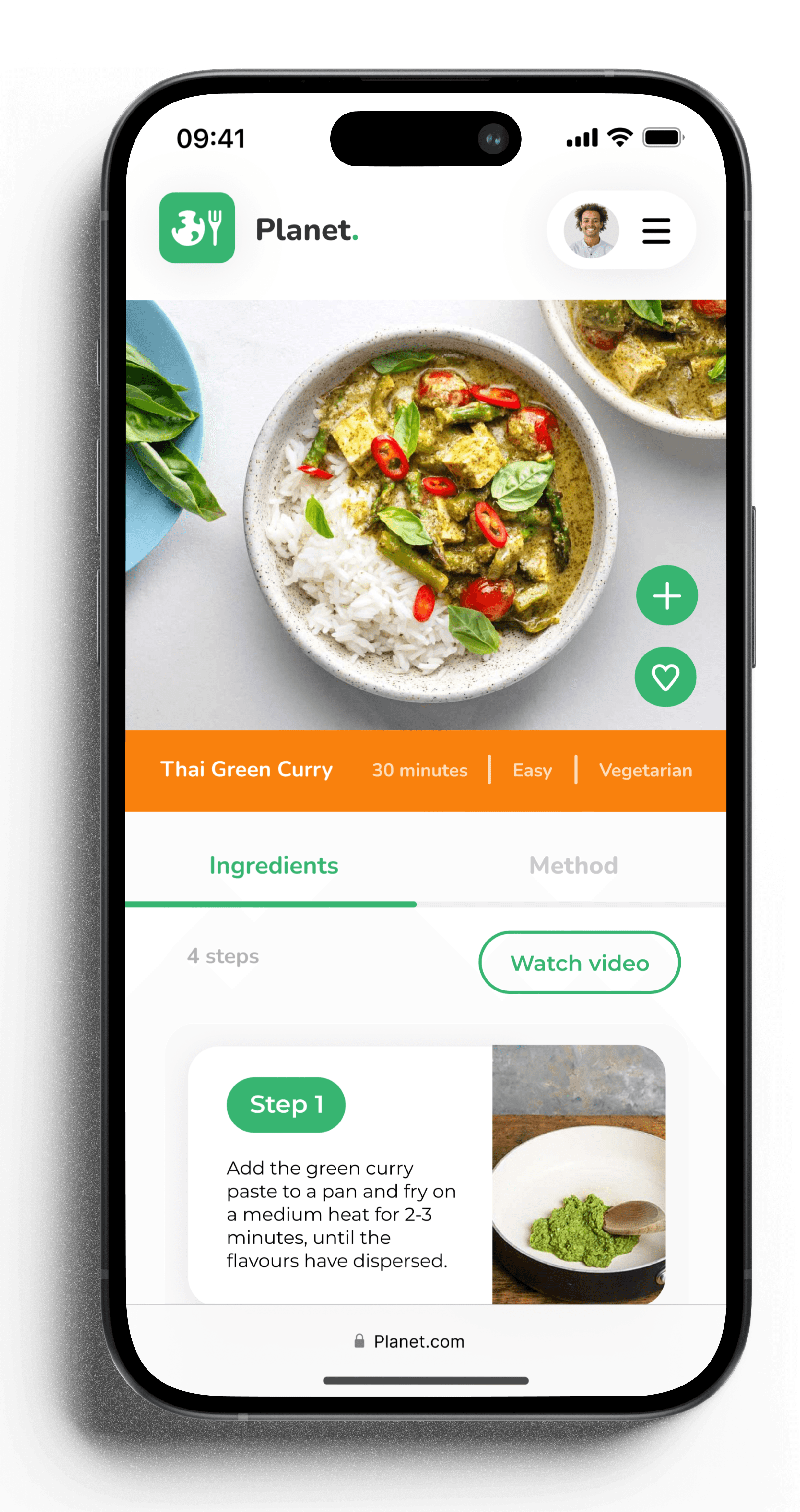
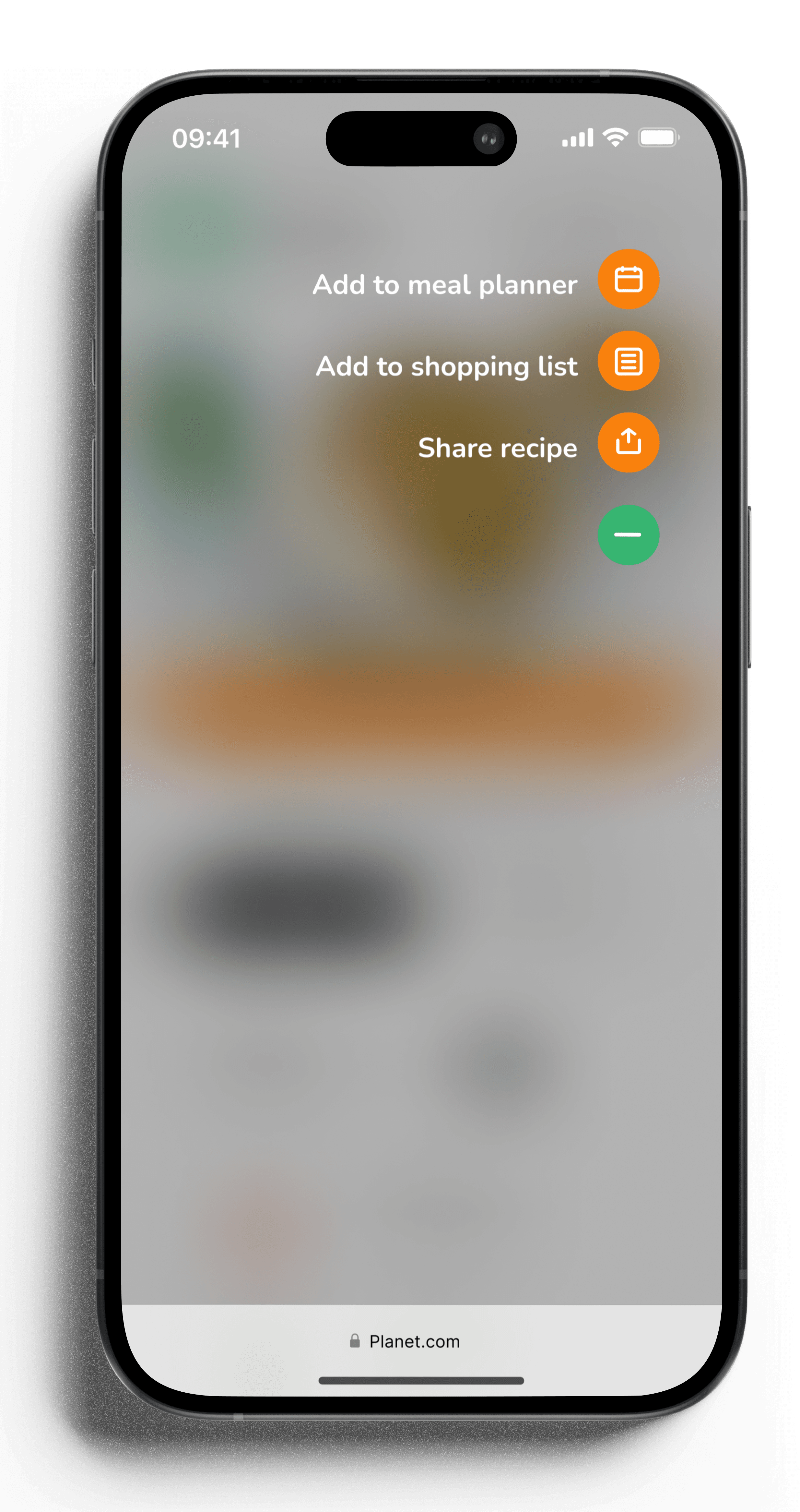
User feedback revealed what worked well and what needed improvement. To enhance usability, I made several changes: I removed the save button, keeping only the favourite icon; replaced the filter icon with text; added a plus button on recipes for sharing, adding to the shopping list, and meal planner; and integrated the search bar into the homepage to reduce clicks. I then transferred these to figma and created my mid-fidelity and high-fidelity wireframes.
Mid-fidelity wireframes

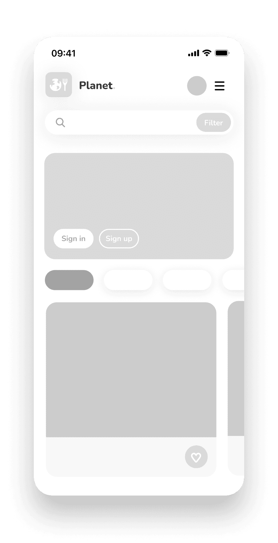


High-fidelity wireframes

I used A/B preference testing throughout the development of my high-fidelity wireframes to test various layouts, colours, fonts and imagery.
Style guide
I chose green and orange as the core colours for my recipe app as they are complementary and symbolise sustainability, enthusiasm, optimism, and warmth. While the app is centred around sustainability, I opted to use a mix of both colours to convey that it is accessible to everyone, not just those who are already environmentally conscious. The typography and imagery were chosen to portray a friendly, welcoming, clear and simple feel.


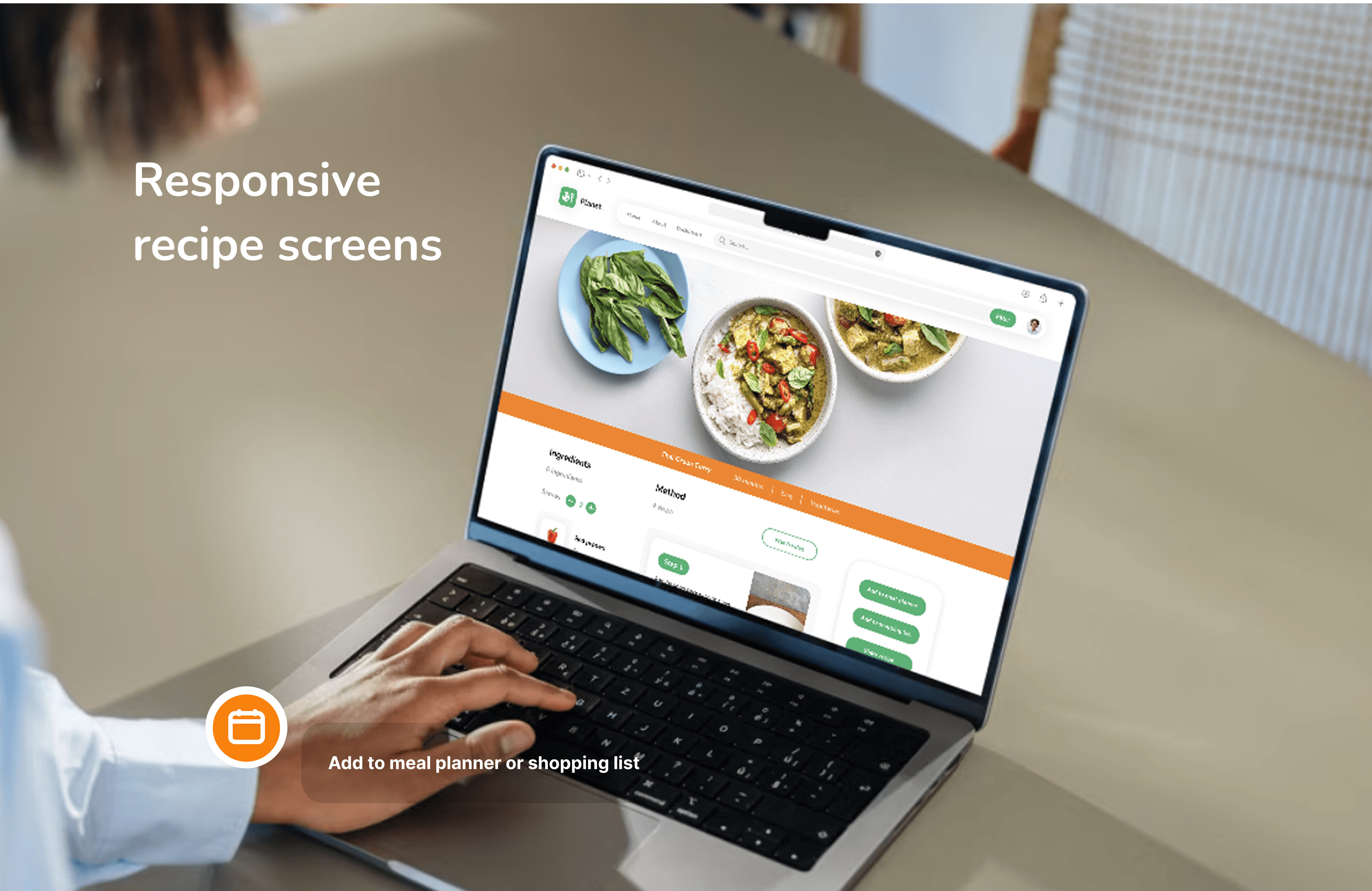
Responsive design
I used a mobile first approach to designing my screens which enabled me to define a hierarchy and prioritise key features before designing my medium and large screens. Designing to different screen sizes ensures the user experience is consistent and intuitive across all devices.


The recipe image occupied too much space on the desktop screen when scaling up the design from XS, S, M & L. The proportions of the image needed changing.
I used the photoshop AI tool to create more background space on the image so I could increase the size of the photo without it taking up too much vertical space on the screen.
Key features
Planet offers unique features, catering specifically to individuals who would like to make more sustainable food choices.
1
Participant | 5
2
Participant | 5
Users expressed a desire to understand why certain meals are sustainable, so each recipe includes a sustainability rating from 1 to 5, called "Planet Points." For those interested in learning more, a "Read More" option is available for additional information.

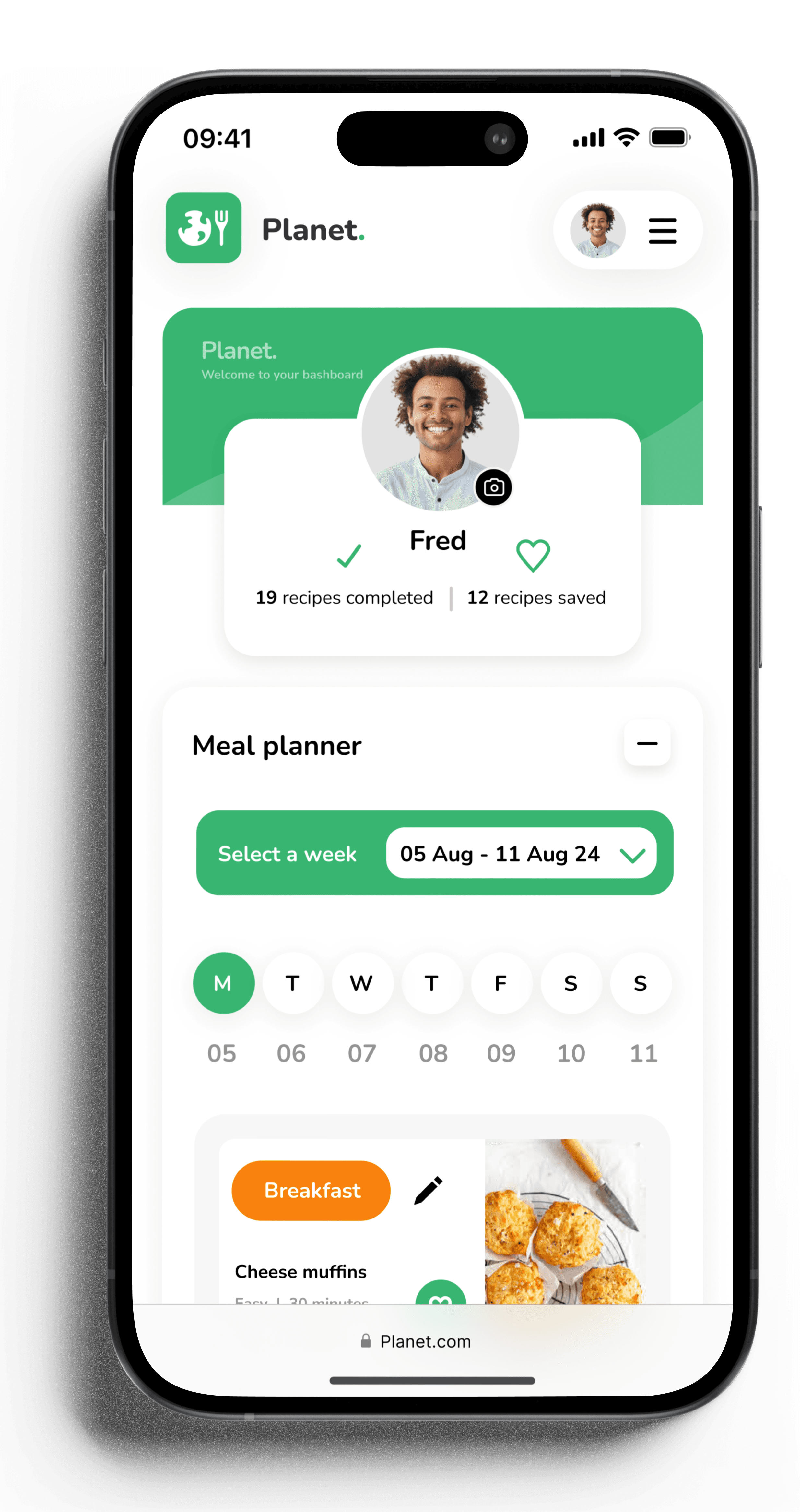
Users indicated they would choose more sustainable eating habits if it were easy and they knew how. The profile feature addresses this need by providing all necessary information in one convenient place.
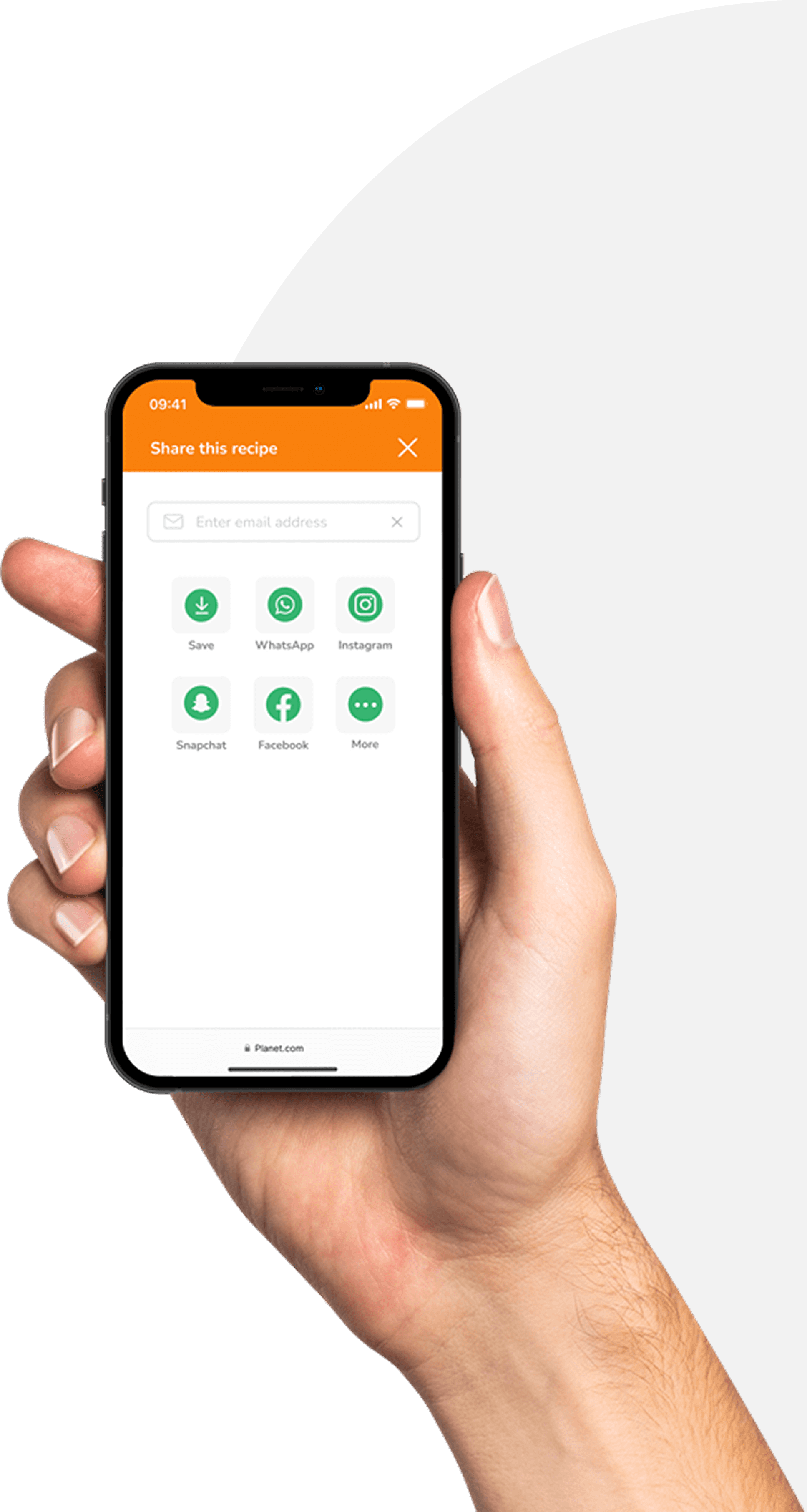
Mobile screens
Users can browse recipes without the need to sign in. However to access all features within the profile, users can create an account and keep a record of all their favourite recipes.


Takeaways
Through designing my recipe app, I honed my ability to interpret user research and market gaps, creating a solution that meets real user needs in a highly competitive space. I prioritized an intuitive, responsive experience that combines concise recipe steps, sustainability guidance, and functional tools like meal planners and store locators—demonstrating my commitment to user-centric design and sustainable innovation.