
About
MI HEALTH is a native app for IOS and Android users that offers an online GP service and hosts personalised health information. It aims to bridge the communication gap between doctors and patients to help them feel empowered and more in control of their health.
Problem
The traditional healthcare process can sometimes feel disjointed, making it difficult for patients to navigate their healthcare journey.


Start-Stop Process
Each visit to the doctor can feel like starting over, making continuity in care challenging

Lack of visualisation
Treatment plans are often not clearly visualised or communicated to patients, leaving them without a clear understanding of the next steps in their healthcare journey

Disconnected care
Without returning to the same doctor, changes in a patient’s condition, symptom triggers and patterns or ineffective treatments may go unnoticed. This can lead to patients living with unresolved health issues, unaware of alternative treatments
Solution
MI HEALTH aims to address the communication gap between patients and doctors by introducing a continuous feedback loop and clear, personalised treatment plans. It also includes a symptom tracker to help patients monitor triggers and chronic conditions over time, providing valuable insights for both patients and healthcare providers. This approach empowers patients with a clearer understanding of their healthcare journey, enhancing their sense of control and ensuring more consistent and effective care.


Brief
The brief was to design a native mobile app for both iOS and Android platforms, ensuring that the features align with the respective iOS Human Interface and Material Design guidelines.
Approach
I used a user centred design thinking approach with Lean UX to create a development process that is both user-focused and efficient. I was responsible for both the UX and UI aspects of the project, from identifying the problem to testing my solutions.
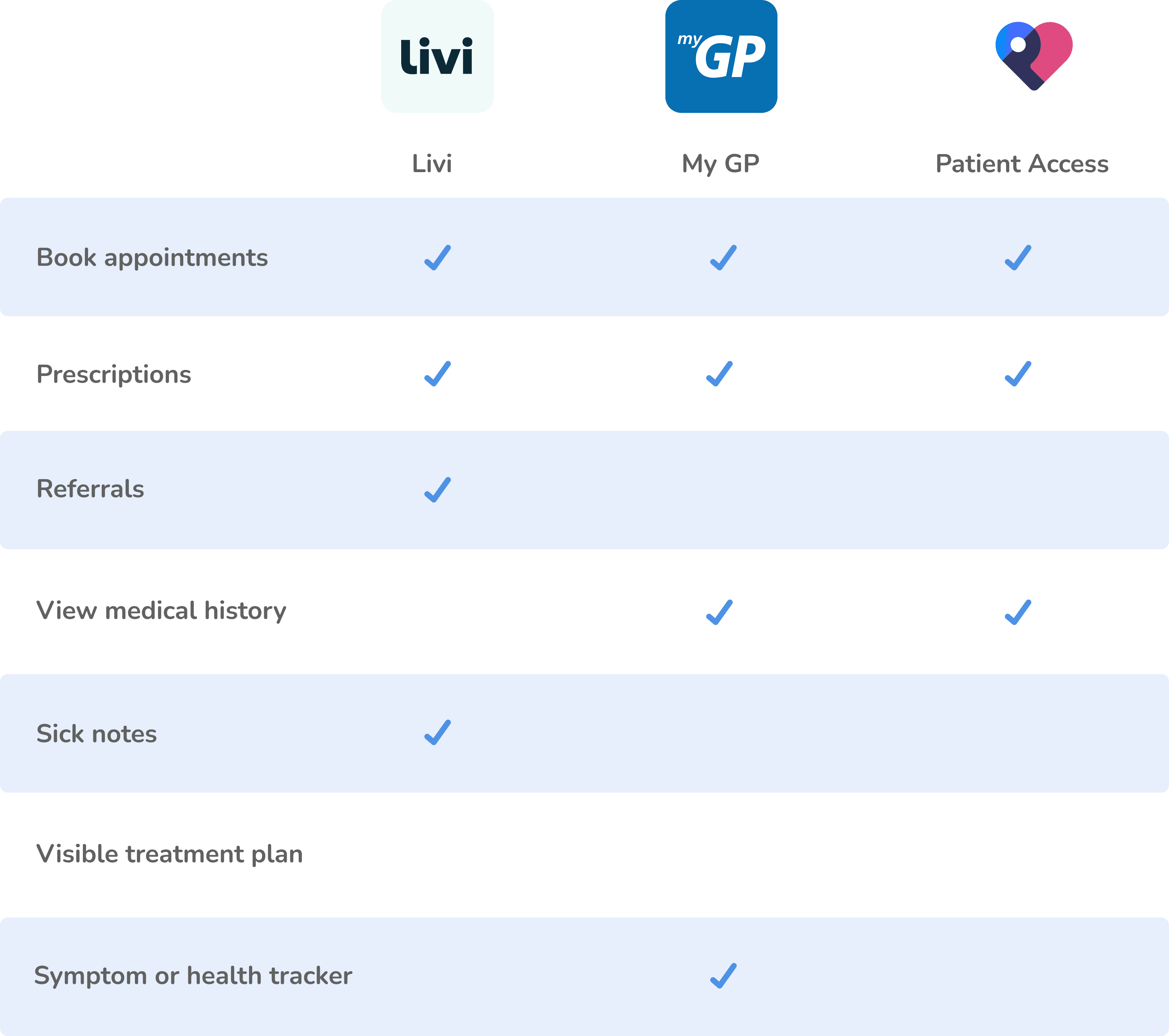
Competitor analysis
My competitor analysis uncovered that whilst many GP apps allow users to book appointments, view medical history, and access test results, they do not necessarily help patients feel more connected to their doctors or more in control of their health.
User research
User research revealed several unmet needs and enabled me to prioritise key features

Participant 1
I’ve been getting extreme tiredness recently and I don’t know if its due to my new medication or something else
Participant 5
I have eczema but nothing I’ve tried works, I feel like nothing will cure me so there’s no point going back to the doctors
Participant 3
It’s been so difficult to get a doctors appointment recently, even when I ring on time there’s no space
The user
I based my user personas on key themes from my user research. This included difficulty monitoring symptoms/side effects effectively and the loss of hope when dealing with a chronic condition.


Minimum viable product
Based on my research, I identified solutions to the key problems. This led me to define my minimum viable product (MVP), which included GP video appointments, personalised treatment plans, and a symptom tracker.
“I’ve been getting extreme tiredness recently and I don’t know if its due to my new medication or something else”
“I have eczema but nothing I’ve tried works, I feel like nothing will cure me so there’s no point going back to the doctors”
“It’s been so difficult to get a doctors appointment recently, even when I ring on time there’s no space”

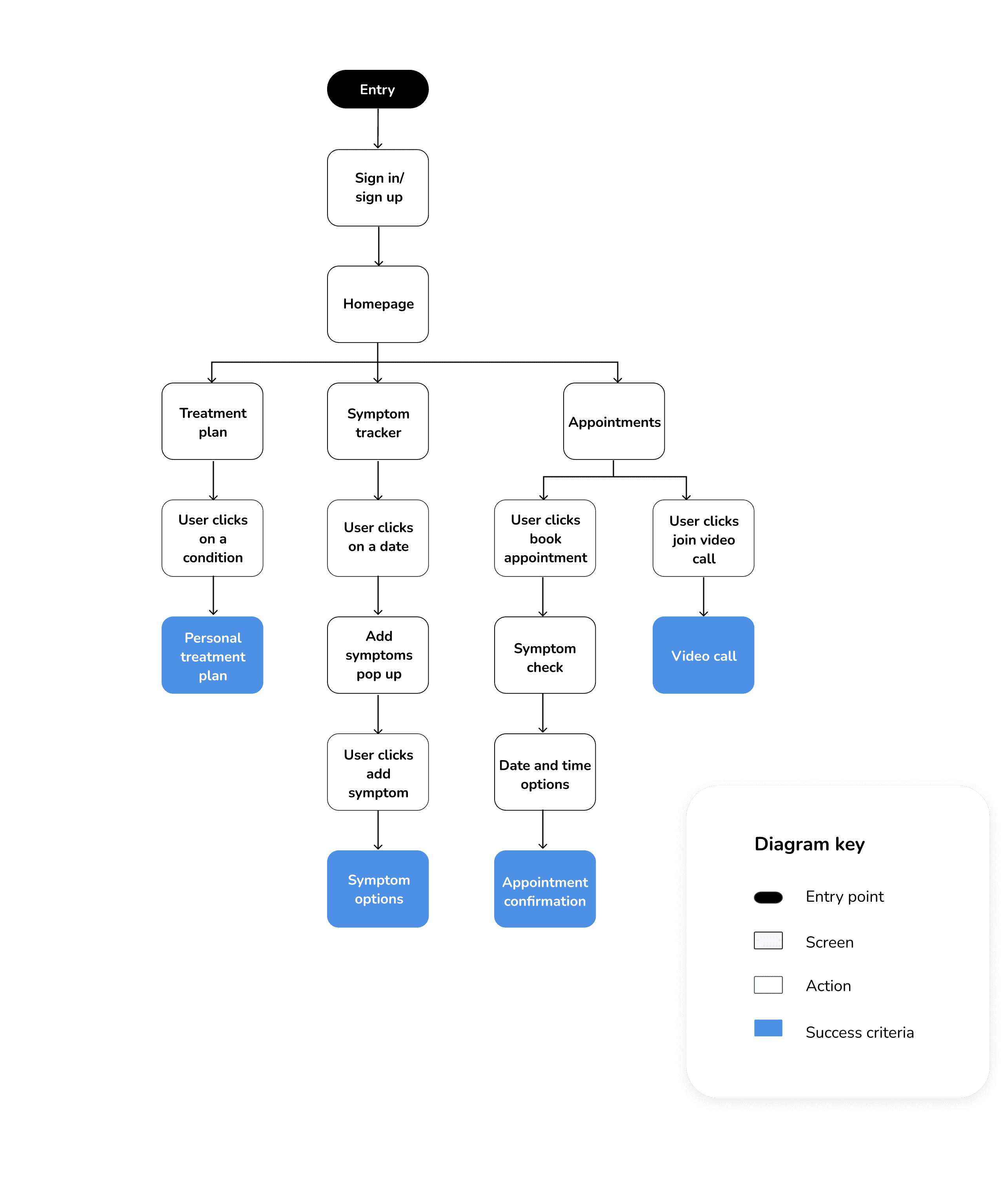
User flow diagram
I designed my user flow diagram to align with the solutions outlined above. Given that the app is personalised for each user, the sign-in/sign-up process serves as the essential entry point. To ensure ease of use, all other features are accessible from the home screen or via the tab bar. Recognising that patients within a wide age range will be using this app, I needed to prioritise simplicity to ensure accessibility for everyone.
Wireframes
Given the importance of sign-in/sign-up functionality and notifications, a native app was the ideal choice over a web app. I designed MI HEALTH to be compatible with both iPhone and Android devices so these adhere closely to the iOS Human Interface Guidelines and Material 3 Guidelines respectively.


Visual style
I chose blue as the core colour to convey a clinical, clean aesthetic and to symbolise trust, as this is an essential quality for a health-related app. My goal for MI HEALTH was to create a design that feels reliable, friendly, and straightforward. I selected red as the accent colour to complement the blue, providing strong contrast and visual impact. The typography and styling for both Apple and Android versions follow the iOS Human Interface Guidelines and Material 3 Guidelines respectively.


Aa
San Francisco
Aa
Roboto


Usability testing
I tested my prototypes on users to gather feedback and refine my designs. This uncovered some usability improvements which I addressed in my next iteration.
IOS
“The bottom tab bar doesn’t stand out enough, its quite easy to miss”
IOS & Android
“On the bottom tab bar, it would make more sense for me if symptoms appeared before appointments”
IOS & Android
“Adding a back button when you’re in the video call would be helpful so users can refer to the app while speaking”
IOS & Android
I have eczema but nothing I’ve tried works, I feel like nothing will cure me so there’s no point going back to the doctors
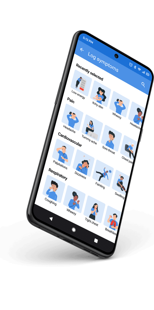
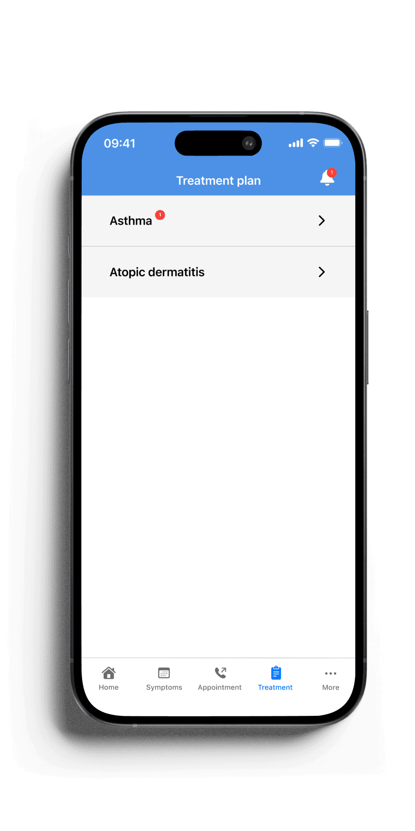
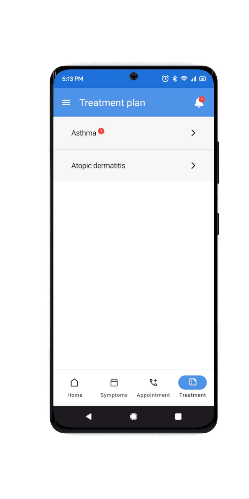
Final IOS and Android screens
I refined my IOS and Android screens following user feedback. This helped me to ensure the best possible user experience and avoid any usability issues. These screens aim to address the 3 key problems by increasing continuity, connectedness, confidence and control.

Sign in using the NHS log in to link health records and access free health support


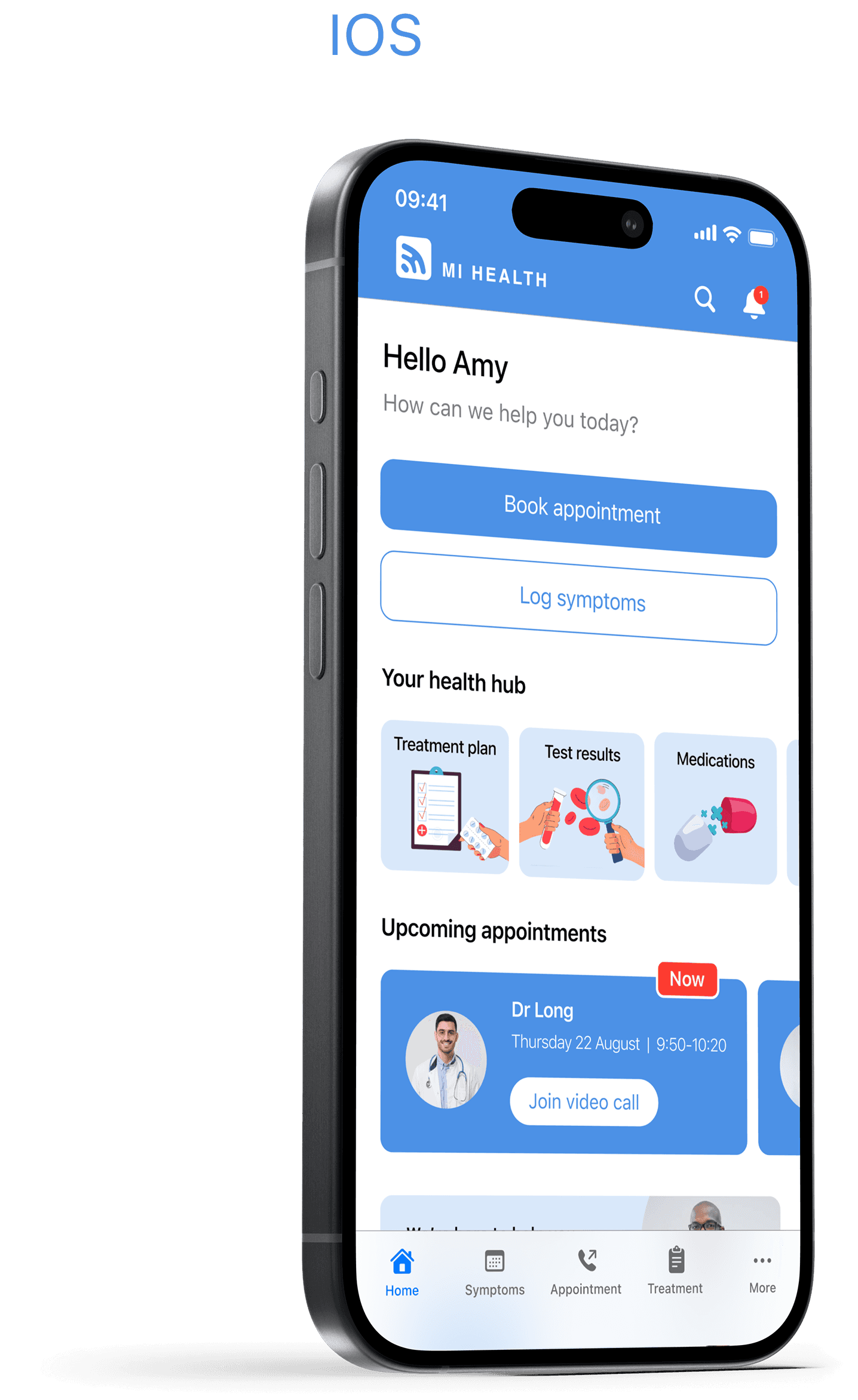
Your health hub

Sign in using the NHS log in to link health records and access free health support

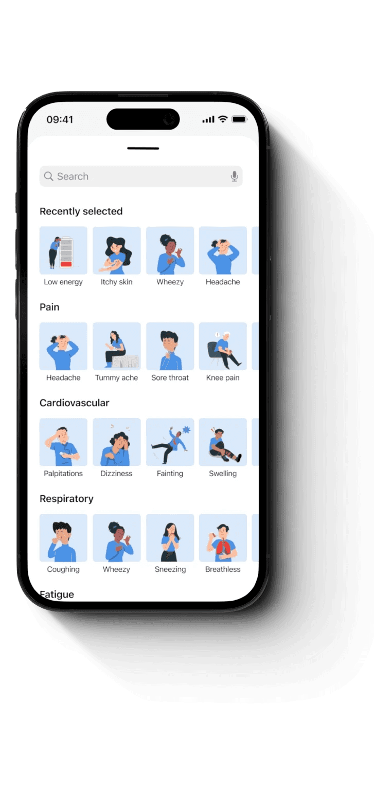
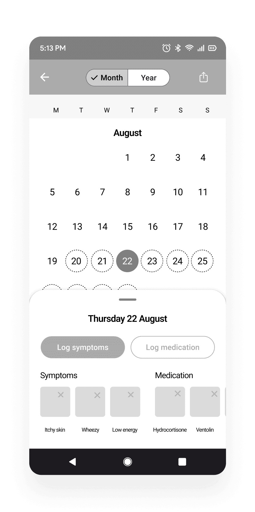
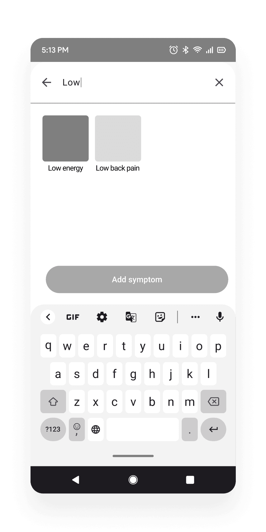
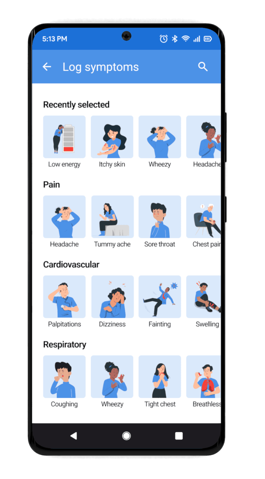
Monitor health conditions and track triggers
By logging symptoms and medications
Sign in using the NHS log in to link health records and access free health support


Book appointments
With a simple step-by-step process
Quick and efficient booking system, ensuring a positive, stress-free experience


Speak to doctors via video call
Quickly and easily
Quick and efficient booking system, ensuring a positive, stress-free experience

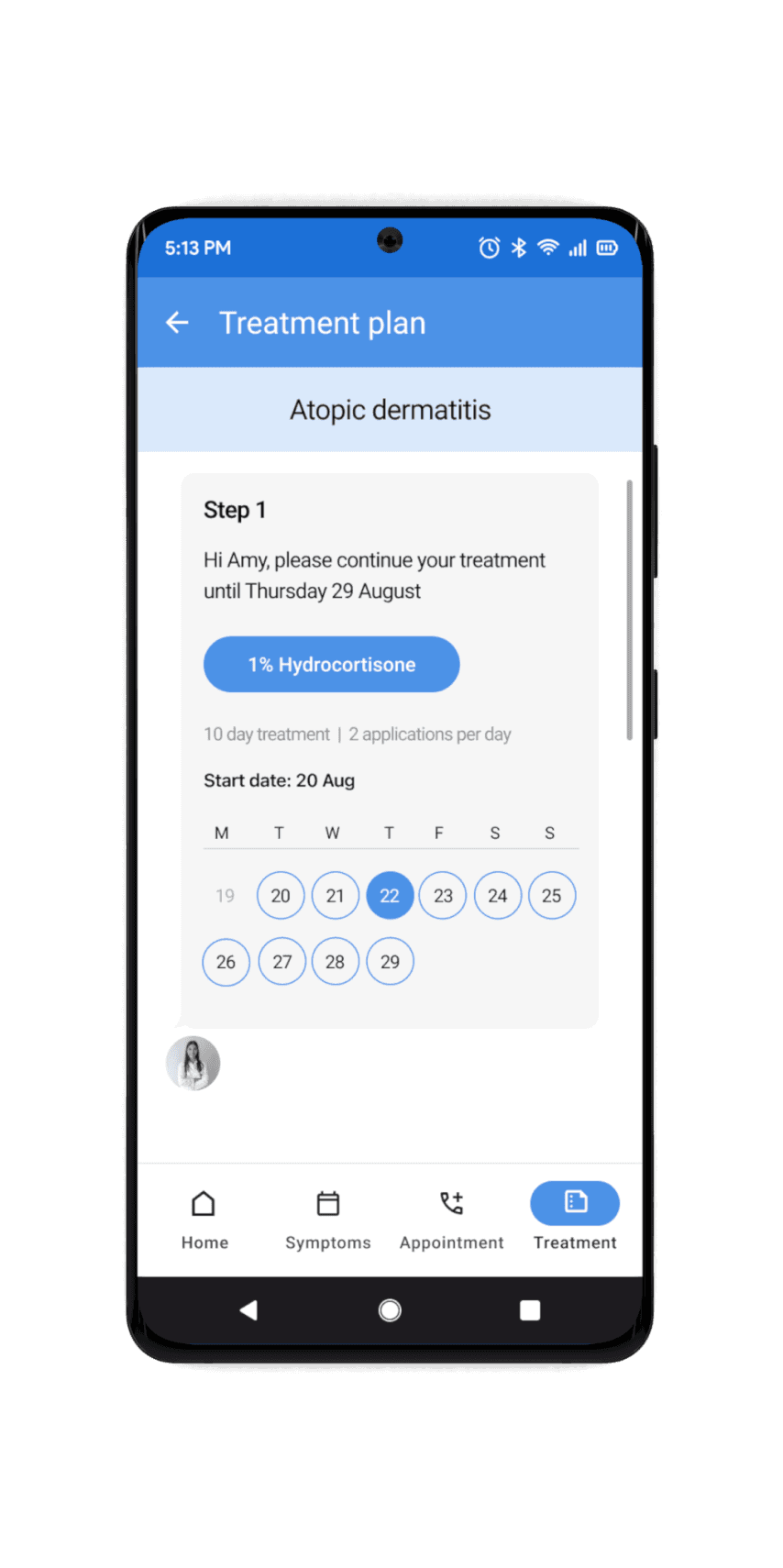
Have better visibility of your treatment
Through access to personalised treatment plans
Simple feedback loop between doctors and patients, generating greater knowledge and better continuity in care


Feel in control
Always know the next steps following treatment e.g, book another appointment, continue treatment, report adverse events etc

Challenge
Healthcare has many regulations and restrictions. I wanted to introduce a feedback loop so doctors know whether a treatment has worked, even if a patient hasn’t returned. However, too much/open feedback can lead to risks due to adverse event reporting
Solution
Keeping the feedback loop short and closed with a simple yes/no followed by next step addresses this challenge but still allows for data to be collected

Takeaways and improvements
Working on MI HEALTH was rewarding as I enjoyed creating a solution that could genuinely help people feel more in control of their health. I focused on balancing a serious medical tone with a touch of lightheartedness, aiming to make healthcare less intimidating. I also needed to consider healthcare regulations when introducing new features, like the feedback loop, which can be a significant challenge in the healthcare field.
