About
Designing for accessibility should always be a priority. In today’s inclusive world, it's essential that products cater to all users.
I’ve built my app with inclusivity at its core, focusing specifically on neurodiverse users, ensuring that everyone can use it comfortably and effectively.
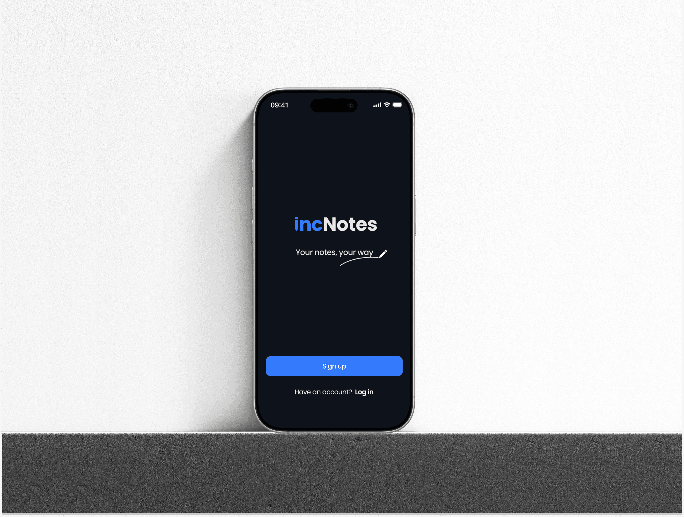
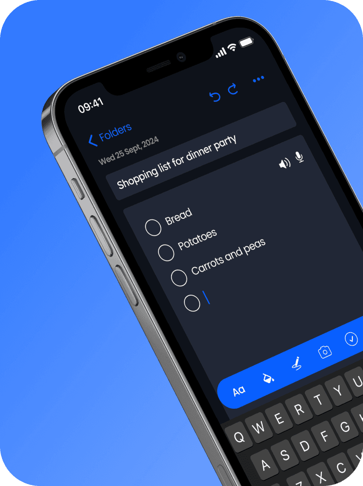
IncNotes is a customisable, accessible notes app designed to support neurodiverse users by offering features like dictation, text-to-speech, and customisable backgrounds and overlays for better focus and readability.
Light mode

Dark mode

Problem
Most notes apps lack the accessibility and customisability needed to support neurodiverse users, making it difficult for them to organise and interact with their notes effectively.
Solution
By offering a highly customisable and accessible platform with tailored features to improve focus, readability, and organisation, this note-taking solution makes the process easier and more inclusive for neurodiverse users.
My role
I was responsible for all aspects of the project, from UX to UI design. This involved research, wireframing, prototyping, and user testing. I collaborated with an educational psychologist who provided valuable insights into the needs of neurodiverse users.
The brief
This was a personal project created as part of my web design course, where the brief was to develop a notes app under the concept of "less is more." I therefore understood that the app needed to have a clean design, be easy to use and solve a problem in a simple way. I decided to focus on inclusivity, particularly for neurodiverse individuals, to create a solution that bridges the accessibility gap.

Approach
I used a design thinking approach throughout the project, progressing through the stages of empathise, define, ideate, prototype, and test. In the empathise phase, I conducted in-depth research to understand what neurodiverse users find helpful, focusing on elements such as background colours, overlays, and adjustable text options.
I collaborated with an educational psychologist to ideate and test solutions, ensuring the features were grounded in expert insights
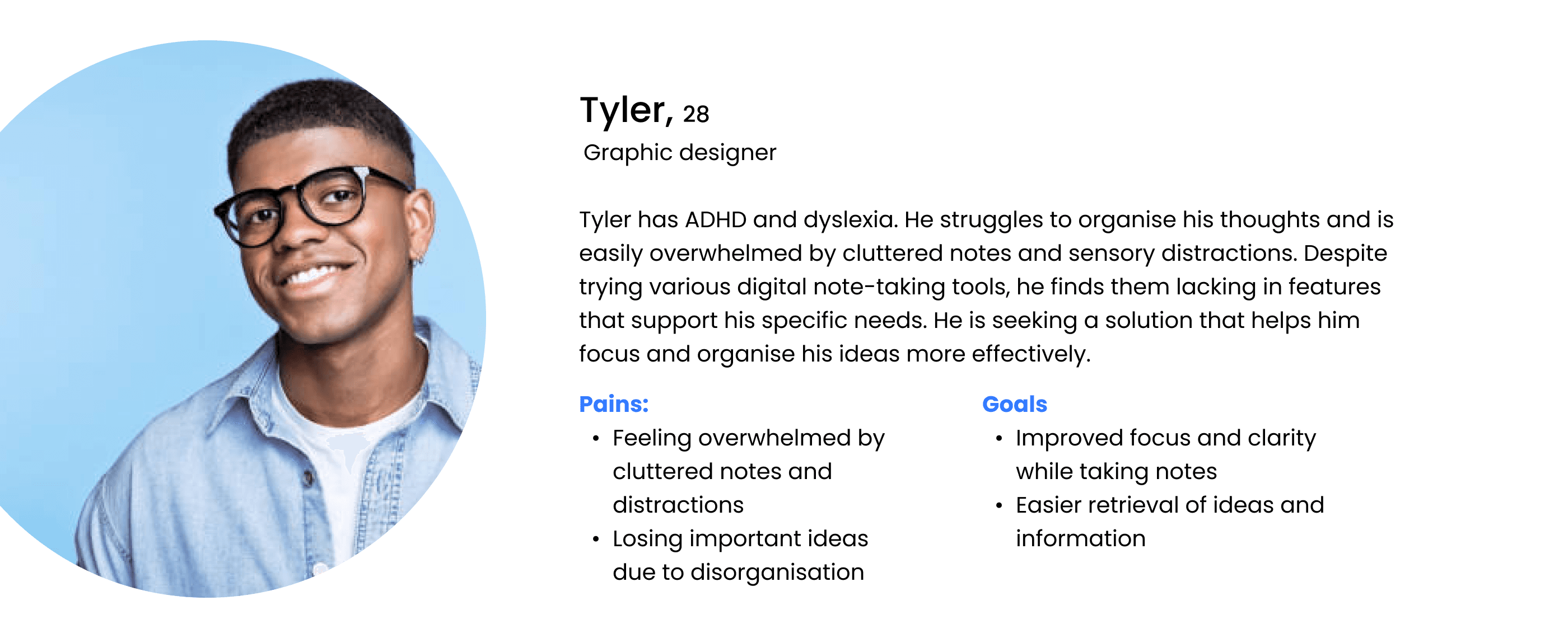
The user

User flow
The success criteria include essential elements for effective note-taking, such as viewing existing notes, creating new folders, and creating new notes. Additionally, to ensure accessibility for neurodiverse users, the app allows users to change note settings and switch between light and dark modes, enhancing customisation
and usability.
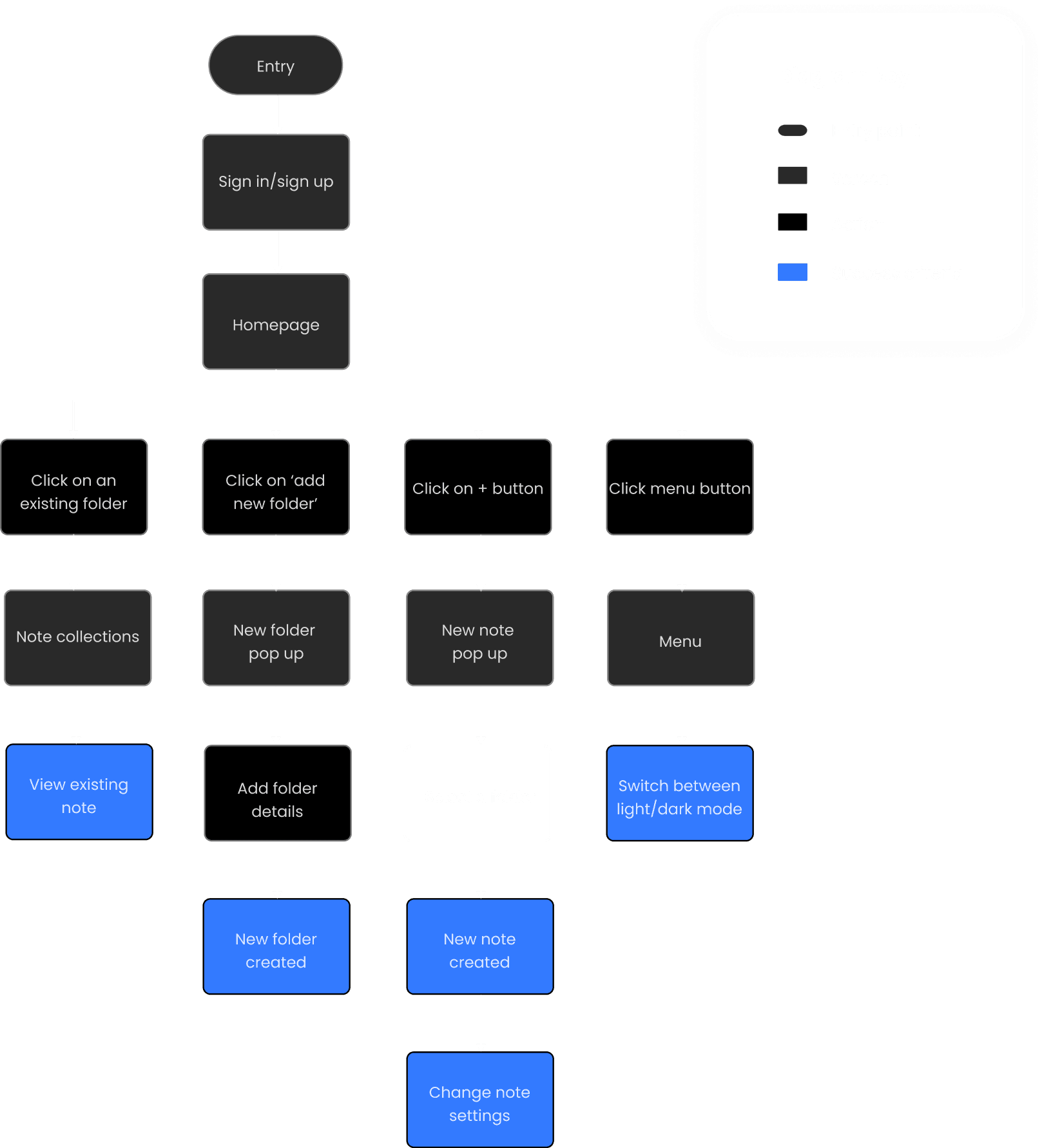
One challenge was deciding whether to require users to select a folder before creating a note. Although it slows down the note-taking process, it significantly improves organisation. User research and expert advice helped validate this decision.
Wireframes
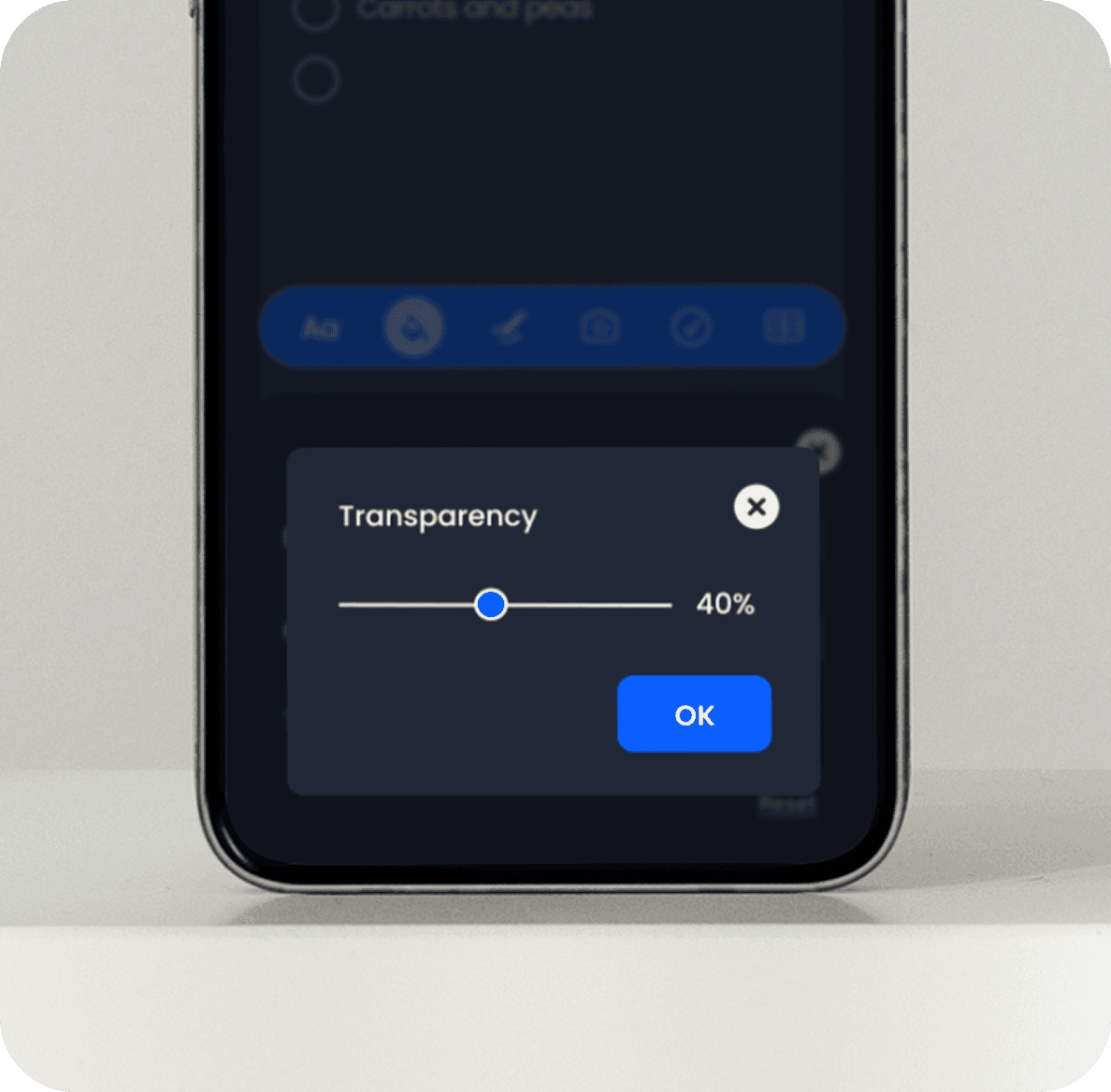
I mapped out my wireframes in Figma, focusing on the core functionality defined in my user flow diagram. To add a new note, I included a large plus button on the homepage for a clear, simple call-to-action. Once a note is created, a navigation bar appears with easy access to tools like text styles, background styles, overlays, pen, table and checklist. Collaborating with an educational psychologist, I defined the options for backgrounds and overlays to reduce visual stress and improve focus for neurodiverse users.

One challenge was deciding whether to require users to select a folder before creating a note. Although it slows down the note-taking process, it significantly improves organisation. User research and expert advice helped validate this decision.
From my research, I discovered that both light mode and dark mode, as well as specific background colours and overlays help support neurodiverse users in different ways. Taking a 'less is more' approach, I carefully selected customisation options to avoid overwhelming users.
Dark mode


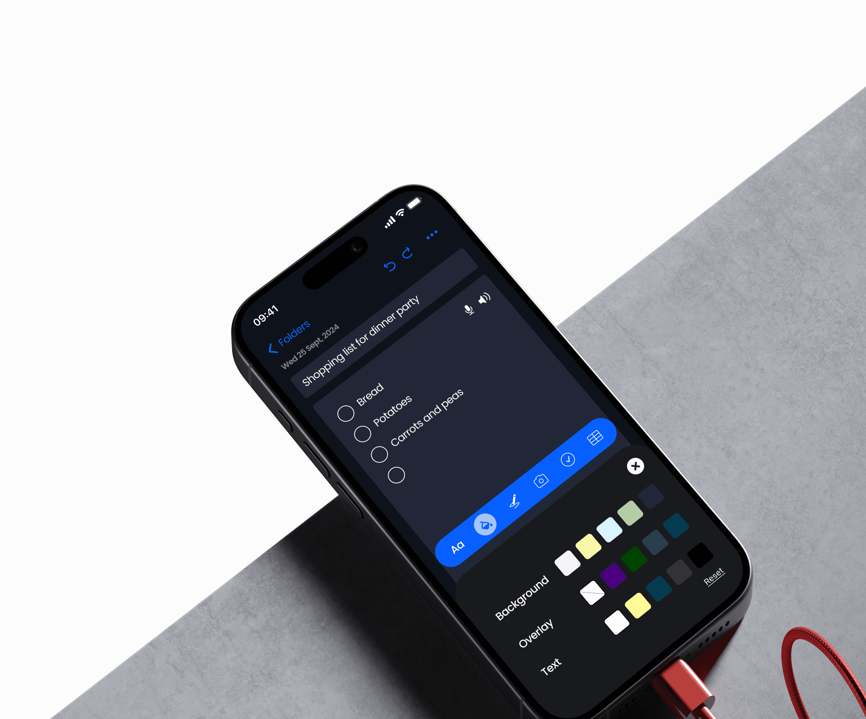
Light mode


Takeaways
Designing for accessibility and inclusivity is crucial for all products. Focusing on this with my app has deepened my understanding of what is helpful or essential for neurodiverse users.
For the next iteration, I plan to conduct user testing with neurodiverse individuals to ensure the customisation options are effective and assess whether more or fewer options, particularly for background colours and overlays, are needed.
Additionally, I would consider adding onboarding screens to guide users through the app's features, making customisation options easy to understand and access from the start.