UI Animation
Izzy Farrar | Adobe After Effects | Figma | Lottie files
INFO
About
HOMI is a smart home app that encompasses the values of control, efficiency, and a futuristic experience. The app showcases UI animations to reinforce these values, creating a smooth and engaging user experience that feels high-tech and effortless.


AIM
Brief
The brief was to design a smart home app with a cohesive visual identity, including a logo and animations, that embodies the app’s core values. This case study showcases how an intuitive interface with seamless transitions and engaging microinteractions can enhance the user experience.
RESPONSIBILITY
My role
I was responsible for designing all UI elements and crafting animations for HOMI, ensuring they aligned with the app's core values. I also refined the user flow to create a smoother and more intuitive experience.

WORK FLOW
Animation process
Research
Define narrative
UX/UI design
Storyboard
Test & iterate
Animate
Principles
HOMI core values
Efficiency
Control
Futuristic
INSPIRATION
Research
I began with extensive research to understand what works well in animation and what should be avoided. My focus was on enhancing the user experience by creating animations that improve usability without being distracting or unnecessary. This involved exploring a wide range of work on platforms like Behance and Dribbble, as well as conducting an in-depth analysis of proven apps with similar core values such as Tesla and Google.

Sleek and modern animations appealing to a tech-savvy audience. Uses a lock state change animation which is particularly effective, offering quick feedback and reinforcing a sense of control without being distracting. Smooth, fluid transitions and sophisticated design enhance the app’s high-tech and futuristic feel
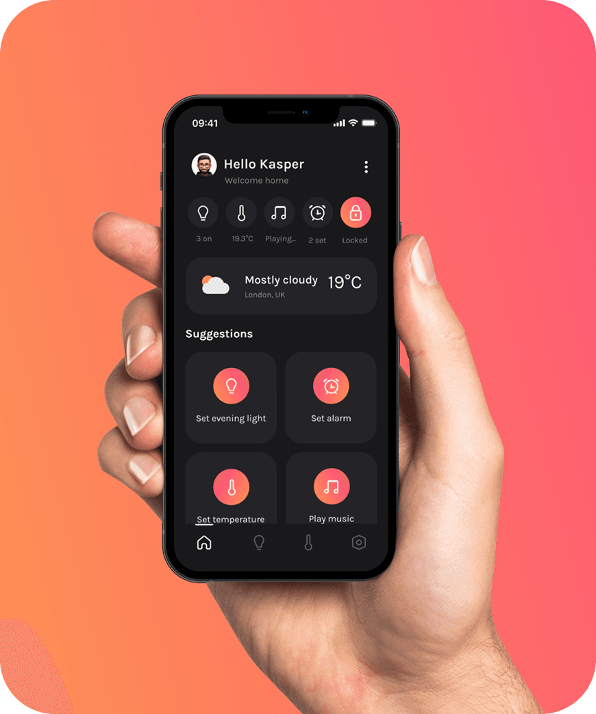
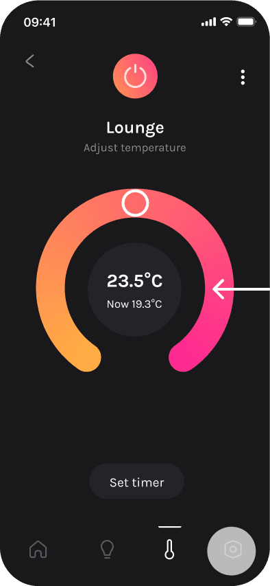
The smooth animations used convey control and efficiency. The temperature dial updates in real-time, giving quick, accurate feedback and allowing users to adjust settings easily from their phone. This saves energy consumption and costs

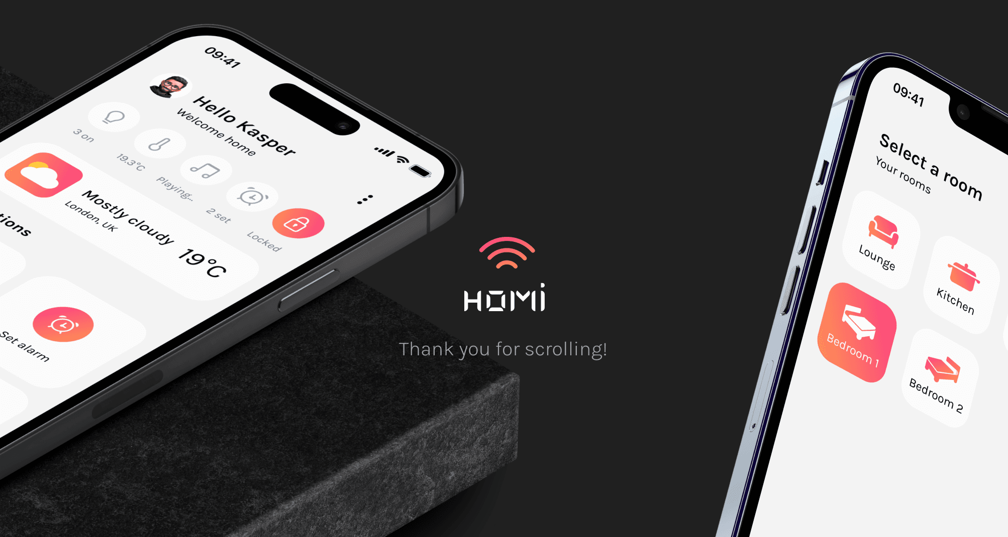
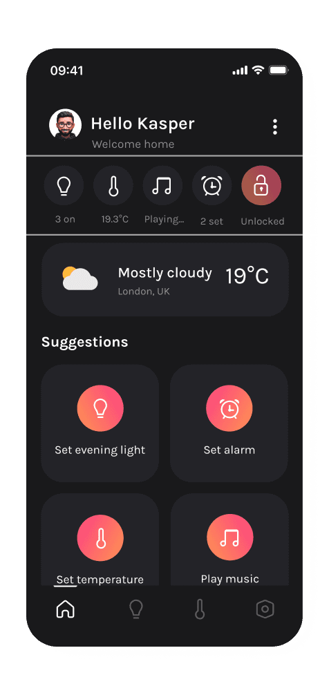
Hello Kasper
Welcome home
Kasper is going to bed soon. He locks the door, turns down the temperature, takes a quick look at the settings and tests out light mode. He then reverts it back to dark as it is night time. He then turns off the bedroom lights ready for sleep.
UX DESIGN
Redefining the user flow
My narrative led me to decide on the following 3 core jobs to be done:
1
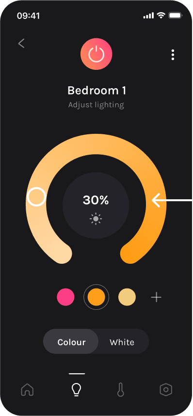
Adjust lighting
2
Adjust temperature
3
Adjust settings
This allowed me to refine the existing user flow and create a smoother experience. The original brief suggested a flow that didn’t include room selection pages, which would leave users without control over which lights to turn on/off and would prevent them from managing room temperatures. This approach didn't align with my core values and could lead to user frustration. It also lacked scalability for future growth and greater control within the app. Therefore, I refined the flow before moving on to low- and high-fidelity sketches.
Entry
Homepage
User clicks light bulb
Room selection
User selects room
Lighting page
User adjusts lighting
User adjusts temperature
Room selection
User selects room
Temperature page
User adjusts temperature
User clicks settings
Settings
User adjusts settings

UI DESIGN
Style guide
Karla is a modern, clean typeface that enhances readability, making it both accessible and easy to navigate while maintaining a contemporary, friendly feel.
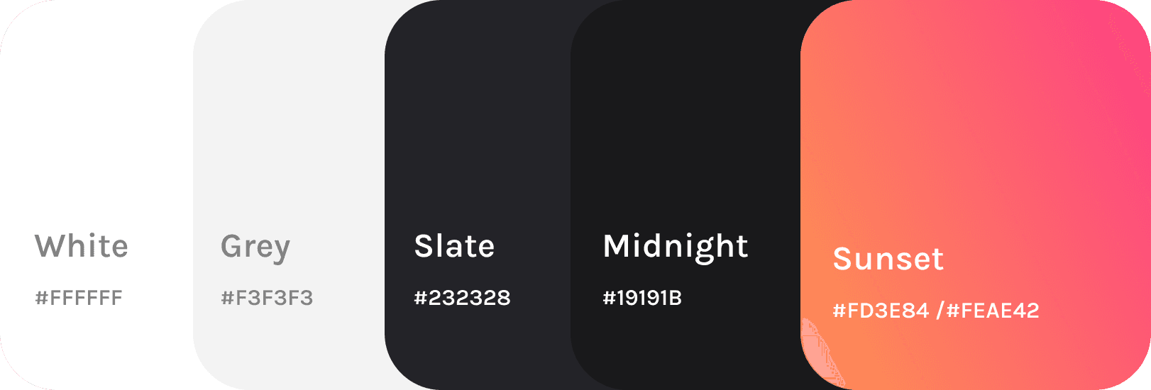
Colour palette
I carefully selected this colour palette as it has a balance of neutral tones for a clean, modern, and sophisticated feel, while the warmth of sunset hues represents energy and vibrancy, adding contrast and visual interest.
Icons
I designed the icons to be simplistic with rounded edges for a modern, futuristic feel, with the settings icon maintaining a familiar shape but in a less defined, more unique style.
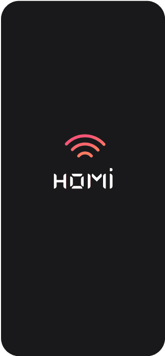
Logo
The logo consists of two parts: the bespoke text font I created, which mimics a digital clock structure and incorporates elements from Tesla to evoke a high-tech feel, and the signal icon in a sunset gradient, with its smooth curves reflecting the app's design and symbolising connectedness and control.


Storyboard
Transitions storyboard
The transitions I chose are designed to feel familiar and intuitive for users. I applied key animation principles, such as "don't get in the way," by keeping transitions simple and unobtrusive—using fade, slide, and zoom effects where appropriate. To maintain continuity, I used standard slide transitions when switching to unrelated tabs and parallax slide transitions for related screens, helping users stay oriented within the app.


Storyboard
Logo animation
For my logo animation, I wanted the signal symbol to appear with a snake-like motion, followed by a text reveal using a gradient effect. The snake-like movement reflects how users control temperature and lights with a sliding motion around a curve, while the faded text reveal aligns with other animations in the app, such as turning lights on and off. This creates a soft, smooth feel, reinforcing the high-tech and futuristic brand identity.


Logo enters in a snake motion
HOMI text appears
Storyboards
Lock microinteraction
User taps lock
Button state change
200ms

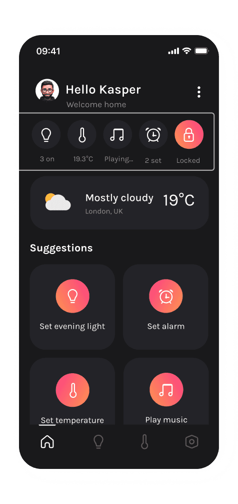
Visually indicating the state of the locks reassures users that an action has taken place. The bright gradient change when locked provides instant clarity, allowing users to see at a glance whether their home is secure without needing to search.
Storyboards
Dark mode microinteraction
User taps slider
Button state change
200ms

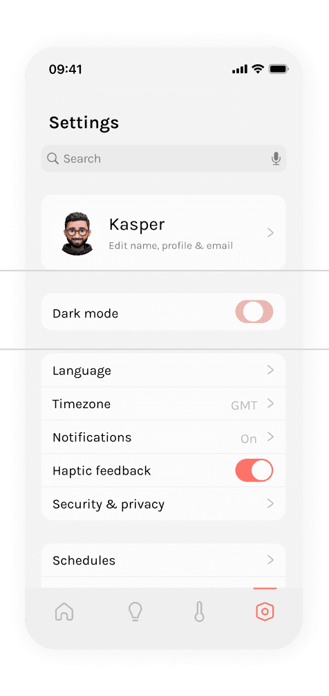
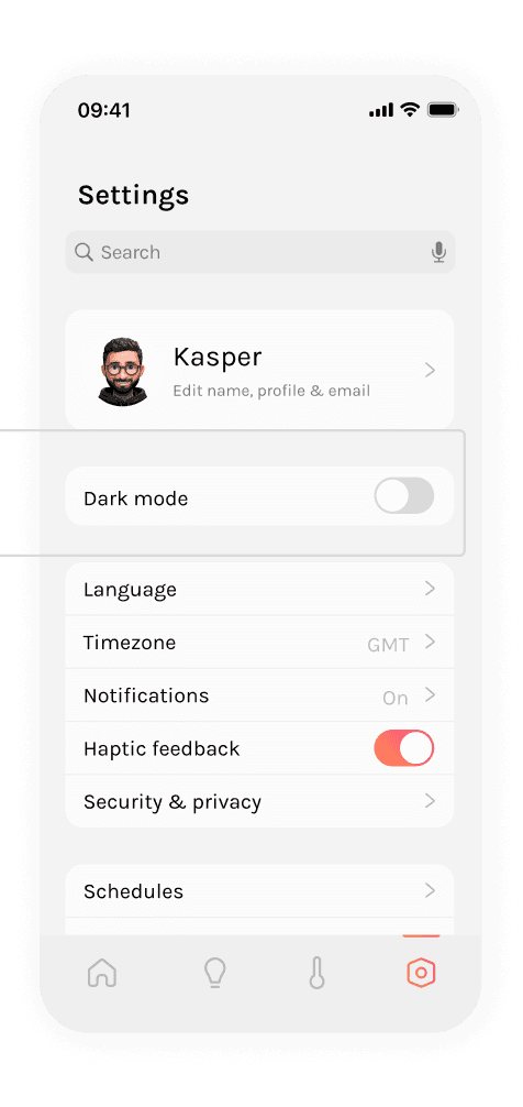
This responsive animation reinforces user control over their preferences, enhancing accessibility and creating an intuitive light-to-dark mode transition.
Storyboards
Light switch microinteraction
User taps slider
Button state change
200ms

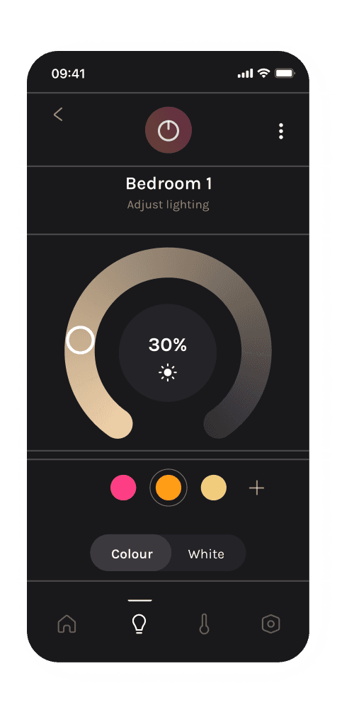
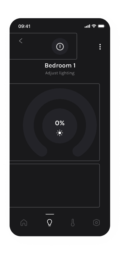
The combination of multiple visual cues—the on/off button state change, the brightness percentage reducing to 0%, and the fading of colour elements into dark grey—provides clear confirmation that the lights have been switched off, reinforcing user confidence and ensuring an intuitive experience.


Reflections
Challenges & solutions
Challenge
You can create so many cool animations on After Effects however not all animations can be converted easily to code.
Solution
Ensuring this is considered early in the project in order to choose methods compatible with code conversion. Testing can be done on Lottie files to validate compatibility.
Challenge
After Effects is resource-heavy, and my laptop's limited RAM slowed down rendering and previewing.
Solution
Upgrading tech will reduce render times and improve preview speed, allowing for a more efficient workflow.
Takeaways
I enjoyed bringing my designs to life with subtle motion graphics in this project, reinforcing how well-placed UI animations can enhance the user experience by guiding interactions. My final solution aligns with the brief, using smooth, subtle animations to create a high-tech yet intuitive feel that builds user confidence.